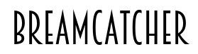
Breamcatcher
Raymond Larabie / Typodermic Fonts Inc. · Regular · Breamcatcher
Preview this font, review the file details, and download the designer's complete package.
About this font
License / Copyright: Free desktop license — see included Typodermic EULA
Author's note:
Official free desktop-license package from Typodermic Fonts Inc.
Included font files: Breamcatcher-Rg.
Download and retain the complete original ZIP, including read-this.html and the Typodermic Desktop EULA 2026.pdf. The included EULA governs use. This package covers only the listed styles; other styles in the commercial family are not included.
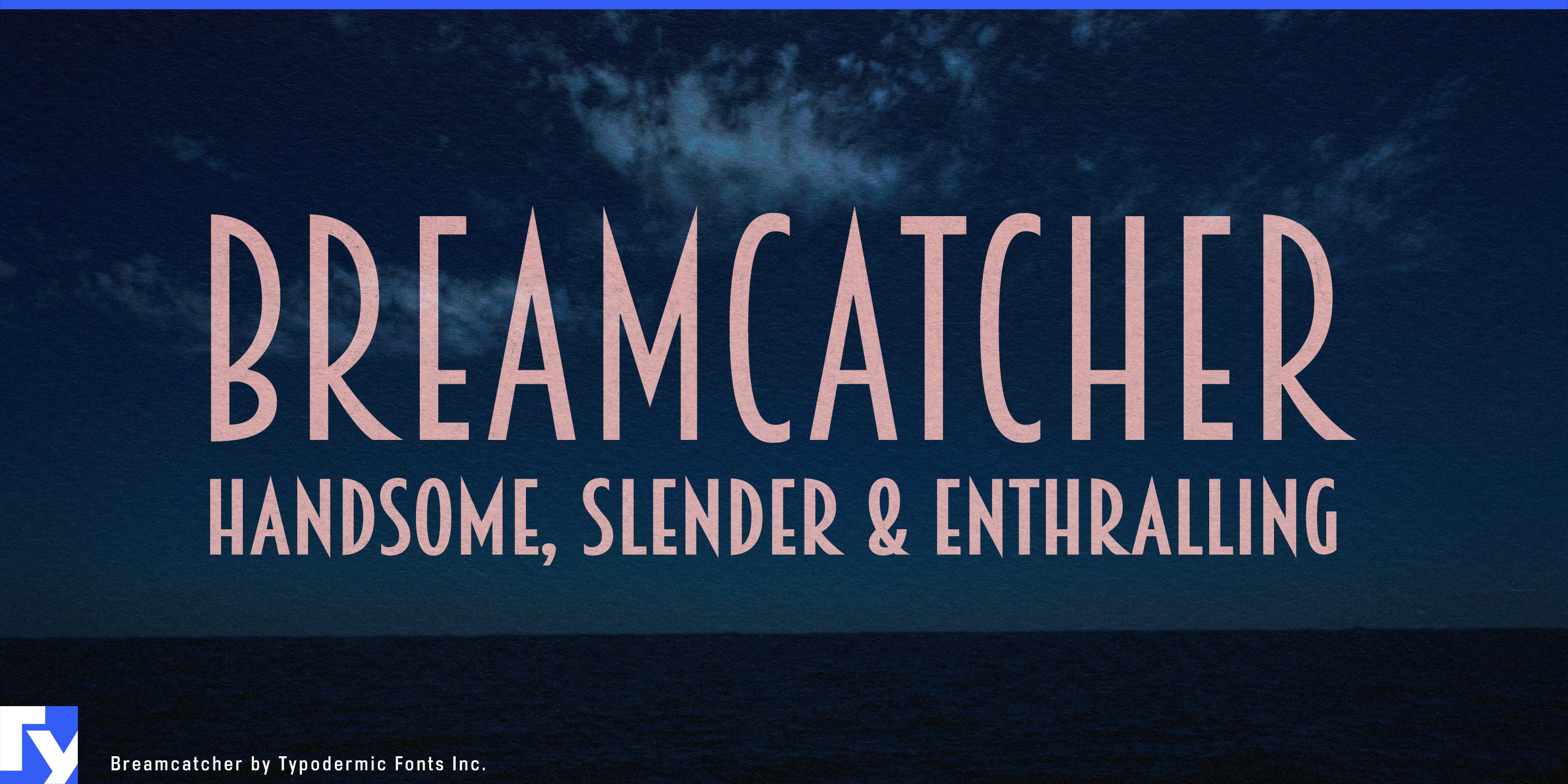
Art Deco is easy to overplay. A restored hotel bar, sleeper train or historic cinema may need the sophistication of the early 1930s without looking like every surface was designed for a Gatsby party. Breamcatcher approaches the period more quietly. Based on commercial lettering from 1934, its tall, narrow forms, generous spacing and sweeping diagonals create atmosphere through proportion rather than geometric ornament.
That makes it particularly useful for hospitality projects with some history behind them. Cocktail lounges inside restored hotels, supper clubs, rooftop restaurants in historic towers and contemporary brasseries can use Breamcatcher for venue names, menu-section headings, private dining rooms, elevator directories and evening programs. Its narrow construction allows long names to remain spacious instead of becoming cramped.
Luxury rail provides another natural setting. Sleeper-train operators and premium rail experiences need route names, dining-car menus, cabin cards, station-lounge graphics, luggage tags and destination headings that can carry a sense of occasion without becoming theatrical. Breamcatcher’s elongated proportions suit these formats particularly well, while its italic can distinguish dining, excursions or evening-service information from the main identity.
Restored cinemas, repertory theatres, cabaret rooms and jazz venues connect naturally to Breamcatcher’s sheet-music origins. Season titles, screening-series graphics, auditorium names, performer names and foyer signage can evoke the early sound-film and dance-orchestra era without imitating a specific movie-poster style. The same restraint suits prestige film and television graphics when a period hotel, nightclub, restaurant or theatre needs believable typography of its own.
Adaptive-reuse architecture offers a contemporary extension. Former hotels converted into residences, old cinemas repurposed as hospitality venues and 1930s office towers becoming mixed-use developments often need identities that acknowledge the building’s history without freezing it there. Breamcatcher can handle building names, rooftop venues, residents’ lounges and amenity names while a quieter companion face carries practical information.
Adult non-alcoholic beverages provide another useful role. Alcohol-free aperitifs, botanical mixers, bitter citrus tonics and sparkling teas designed for bars rather than soft-drink aisles often need to look grown-up without merely imitating spirits packaging or retreating into wellness minimalism. Breamcatcher’s tall proportions suit bottle labels and cartons, while its 1930s hospitality character can suggest cocktail-bar culture without requiring alcohol.
Official information and additional styles:
https://typodermicfonts.com/breamcatcher/
Is this your font? Claim it
Illustration and Share




Reader comments
Share feedback or usage notes for this font.
No comments yet. Be the first to leave one.