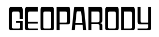
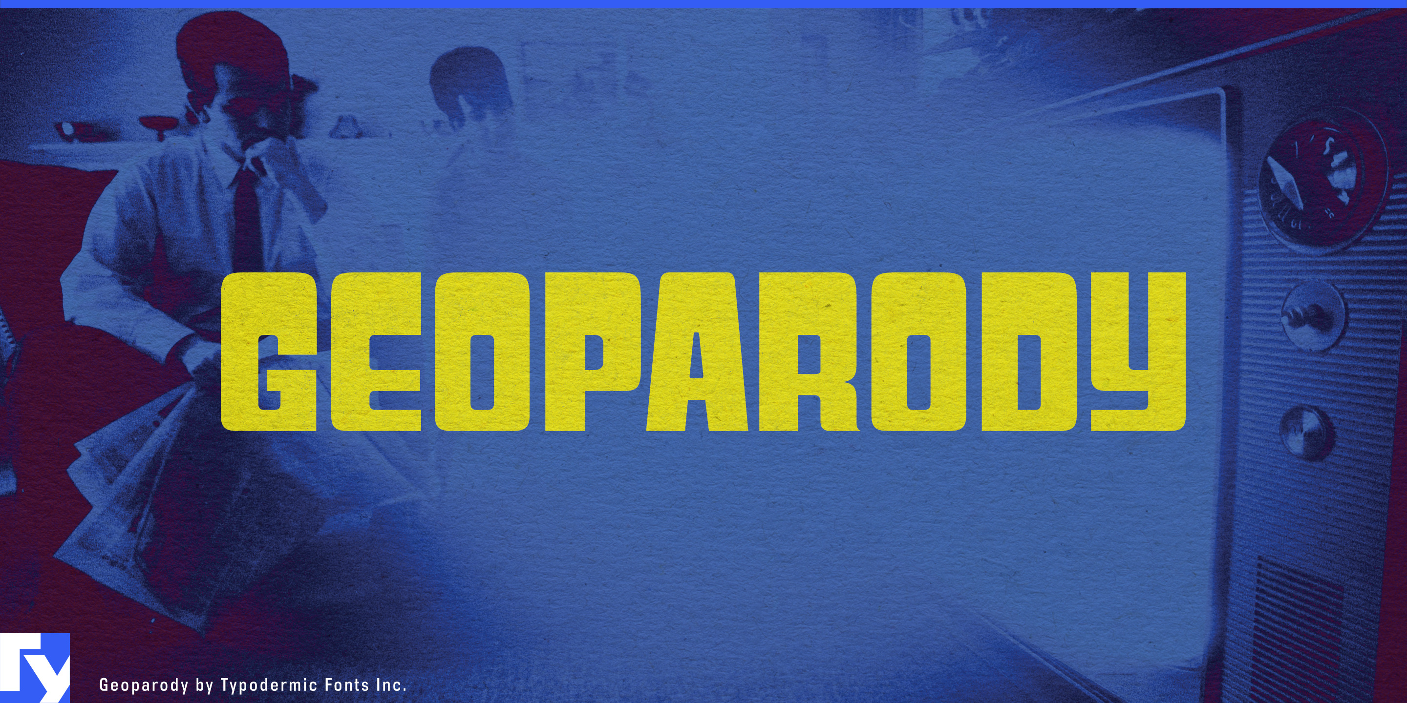
Geoparody
Raymond Larabie / Typodermic Fonts Inc. · Regular · Geoparody
Preview this font, review the file details, and download the designer's complete package.
About this font
License / Copyright: Free desktop license — see included Typodermic EULA
Author's note:
Official free desktop-license package from Typodermic Fonts Inc.
Included font files: Geoparody Rg, Geoparody Hv.
Download and retain the complete original ZIP, including read-this.html and the Typodermic Desktop EULA 2026.pdf. The included EULA governs use. This package covers only the listed styles; other styles in the commercial family are not included.
Many retro-futurist display faces work at one volume. They can make a striking headline or wordmark, then become difficult to extend into a broader identity. Geoparody has a wider operating range. Its thinnest styles are linear, disciplined, and architectural; as the weight increases, the same flat-sided geometry becomes more assertive, while the heavy italics introduce genuine speed and impact.
That range makes Geoparody especially useful for specialty coffee. Thin and Extra-Light suit espresso bars and serious roasters focused on beans, origin, processing, and extraction rather than nostalgic café atmosphere. Oversized origin names, microlot cards, pour-over menus, subscription boxes, cold-brew bottles, coffee bags, and equipment displays can use its precise geometry without becoming sterile. Heavier weights can carry the roaster name or product line while the lighter styles handle technical information and secondary display text.
At the opposite end of the family, the heavy italics suit speed-oriented sports such as track cycling, speed skating, downhill skiing, bobsleigh, badminton, squash, and motorsport. Athlete names, timing graphics, race numbers, venue banners, equipment launches, and shoe or racket model campaigns benefit from lettering that feels engineered without falling into the usual blocky athletic vocabulary.
Science and public technology occupy another useful territory. Planetariums, observatories, aerospace museums, robotics exhibitions, engineering conferences, science-center interactives, and university technology showcases often need typography that feels technical without resembling a software interface. Geoparody can handle exhibit titles, large diagrammatic headings, section numbers, wayfinding, and promotional graphics with a distinctly physical, engineered quality.
Its lighter styles also fit modernist architecture and design: house museums, architectural tours, prefab-home companies, furniture and lighting showrooms, modernist hotels, design exhibitions, and residential developments. Building names, floor numbers, room identifiers, directory headings, and campaign typography can all benefit from its narrow geometric structure.
Geoparody can also move onto carefully designed physical equipment such as hi-fi components, synthesizers, studio monitors, espresso machines, architectural lighting, and precision kitchen hardware. Fine weights can carry model names and technical designations; heavier styles give product families a stronger identifying mark.
The family’s real advantage is the distance it can travel without losing its underlying geometry. Geoparody can move from a hairline coffee-roaster identity or architectural display to the heavy italic typography of a velodrome championship, giving designers several distinct levels of intensity within one coherent display system.
Official information and additional styles:
https://typodermicfonts.com/geoparody/
Illustration and Share
Reader comments
Share feedback or usage notes for this font.
No comments yet. Be the first to leave one.