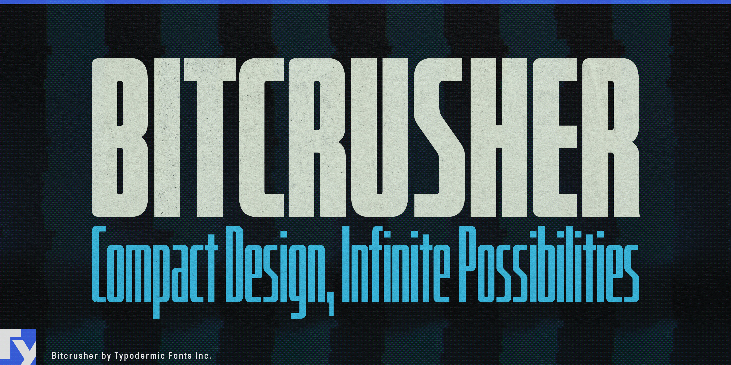
Bitcrusher
Raymond Larabie / Typodermic Fonts Inc. · Regular · Bitcrusher
اعرض هذا الخط، وراجع تفاصيل الملف، ونزّل الحزمة الكاملة من المصمم.

عن هذا الخط
الترخيص / حقوق النشر: Free desktop license — see included Typodermic EULA
ملاحظة المصمم:
Official free desktop-license package from Typodermic Fonts Inc.
Included font files: bitcrusher condensed bd.
Download and retain the complete original ZIP, including read-this.html and the Typodermic Desktop EULA 2026.pdf. The included EULA governs use. This package covers only the listed styles; other styles in the commercial family are not included.
The copy gets longer, but the container does not. A driver surname has to fit the same timing graphic as every other name. A product model suddenly acquires three more words. A vertical campaign needs to keep its headline large without covering the subject. Shrinking the type may make everything fit, but it also weakens the message. Bitcrusher offers another option: reduce the width instead of the height.
Even Bitcrusher’s roomiest styles are condensed. From Condensed through Compressed, Crammed and Crushed, the family provides increasingly severe levels of horizontal compression, with five weights at each width. Start comfortably; move narrower only when the content demands it.
That range is especially useful in live sports and broadcast graphics. Timing towers, race standings, player cards, qualifying results, statistics panels and lower thirds must accept names and data that cannot always be predicted when the template is built. Bitcrusher can keep a long athlete surname, constructor name or event title prominent instead of forcing the entire graphic to shrink. Its original automotive influences make motorsport, EV racing and vehicle launch graphics particularly natural settings.
The same problem appears in vertical video and responsive campaign systems. A headline designed for a wide display may have to survive a narrow phone screen, streaming promotion or social clip while sharing space with photography, captions and interface elements. Bitcrusher keeps the type large while reducing its horizontal footprint, and its progressively narrower widths can absorb long translations or awkward campaign variants without abandoning the visual system.
Hardware naming creates another useful role. AI workstations, network appliances, robotics controllers, battery systems, audio interfaces and industrial electronics often carry long product names and model designations across fixed-width chassis, faceplates and packaging. Bitcrusher can handle the prominent product family or model name while a quieter sans carries instructions and specifications.
Bitcrusher grew from automotive and consumer-electronics references, translated into a narrow stovepipe construction with tight corner curves. At the most extreme widths, characters such as M, W and w abandon diagonals that no longer function in the available space; the geometry changes to accommodate the constraint rather than simply squeezing conventional forms thinner.
For sports templates, vertical campaigns, equipment panels and technical product identities, Bitcrusher gives designers somewhere to go before “make it smaller” becomes the only answer.
Official information and additional styles:
https://typodermicfonts.com/bitcrusher/
هل هذا خطك؟ طالِب به
الصورة والمشاركة





تعليقات القراء
شارك رأيك أو ملاحظاتك حول استخدام هذا الخط.
لا توجد تعليقات بعد. كن أول المعلّقين.