Disassembler
Raymond Larabie / Typodermic Fonts Inc. · Regular · Disassembler
اعرض هذا الخط، وراجع تفاصيل الملف، ونزّل الحزمة الكاملة من المصمم.

عن هذا الخط
الترخيص / حقوق النشر: Free desktop license — see included Typodermic EULA
ملاحظة المصمم:
Official free desktop-license package from Typodermic Fonts Inc.
Included font files: disassembler grid.
Download and retain the complete original ZIP, including read-this.html and the Typodermic Desktop EULA 2026.pdf. The included EULA governs use. This package covers only the listed styles; other styles in the commercial family are not included.
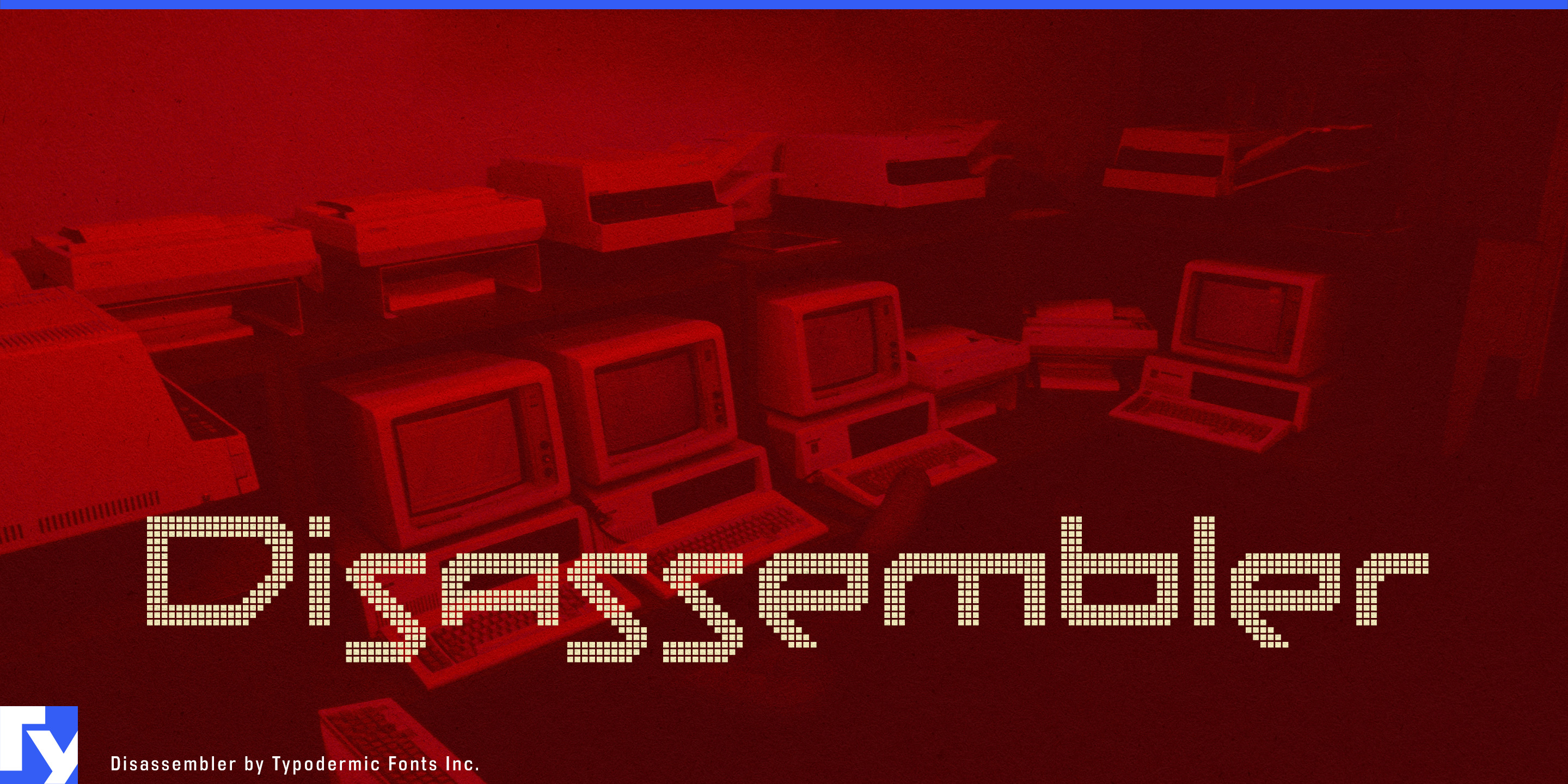
Disassembler is a pixel-built display family that gets more interesting as it gets bigger. Its eight styles begin with the same blocky letterforms, then alter the surface: pixels close up, separate into fine grids, break into lattice and mesh structures, form networks, pick up horizontal screen interference, or change shape entirely. At headline size these differences are obvious; spread across a trade-show wall, exhibition display, launch film, or full-screen website, the gaps and patterns become part of the image.
The alphabet itself has an unusual rhythm. Disassembler’s capitals don’t settle into the visually even proportions associated with generic bitmap lettering; broad and narrow forms bump against one another, giving names and short phrases a slightly awkward, engineered silhouette. That irregularity helps the family escape the familiar retro-pixel look.
Disassembler is particularly well suited to the technological side of defence branding. Autonomous systems, military aerospace, radar and sensing, secure communications, surveillance technology, simulation, and electronic warfare all provide contexts where its fragmented geometry can feel purposeful rather than decorative. On defence-contractor exhibition stands, product-launch graphics, equipment-family identities, demonstration films, and large technical-marketing displays, the finer styles can suggest arrays, signal processing, targeting screens, telemetry, or electronic hardware without imitating a specific interface. This is display typography for the presentation layer around the technology, rather than something intended for dense operational information.
The same construction can turn considerably darker in cybersecurity. Mesh, Network, Lattice, and Screen can make a headline appear scanned, intercepted, filtered, or partially reconstructed. Used for threat-intelligence campaigns, security-product launches, red-team services, incident-response graphics, conference stages, or large website headlines, Disassembler can move toward a sinister near-future atmosphere without resorting to the standard neon cyberpunk vocabulary. Put it beside surveillance photography, thermal imagery, maps, machine vision, or austere technical diagrams and those narrow gaps start feeling less like retro pixels and more like compromised information.
The eight styles provide different degrees of that effect. Regular keeps the underlying forms comparatively direct. Grid, Lattice, Mesh, and Network progressively turn the letters into structures. Screen interrupts them with a stronger display texture, while Circle and Star replace the expected square pixel with more conspicuous repeating units. Because the construction becomes easier to see as the type grows, changing styles can create hierarchy within a single visual system: a relatively solid product name, a screened campaign title, or an enormous patterned word used almost as an architectural graphic.
Official information and additional styles:
https://typodermicfonts.com/disassembler/
الصورة والمشاركة
تعليقات القراء
شارك رأيك أو ملاحظاتك حول استخدام هذا الخط.
لا توجد تعليقات بعد. كن أول المعلّقين.