Mexcellent
Raymond Larabie / Typodermic Fonts Inc. · Regular · Mexcellent
预览此字体,查看文件详情,并下载设计师提供的完整字体包。

关于这款字体
许可 / 版权: Free desktop license — see included Typodermic EULA
作者说明:
Official free desktop-license package from Typodermic Fonts Inc.
Included font files: Mexcellent Rg, Mexcellent 3d.
Download and retain the complete original ZIP, including read-this.html and the Typodermic Desktop EULA 2026.pdf. The included EULA governs use. This package covers only the listed styles; other styles in the commercial family are not included.
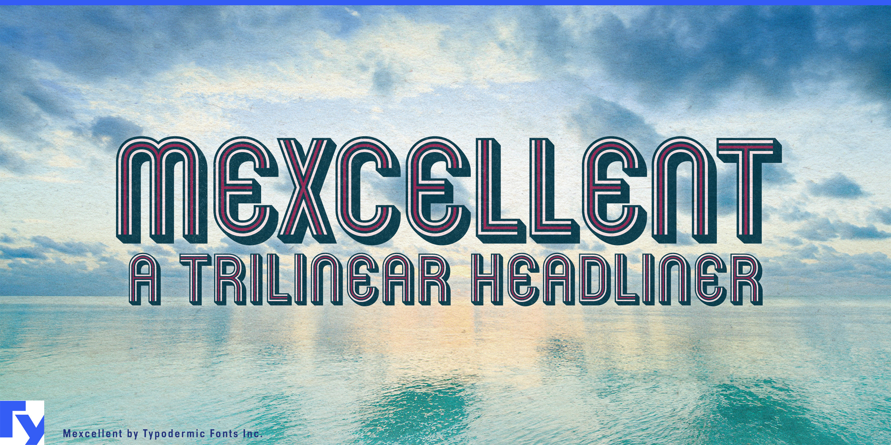
A striped headline is easy to use once. The harder job is carrying it through team colorways, live footage, product variants, motion graphics and fabricated signage without rebuilding the lettering every time. Mexcellent’s free Regular and 3D styles provide finished effects; Back, Middle and Outside expose the construction, separating the solid body, central line and outer stripes so each component can be controlled independently.
Back supplies an opaque silhouette that remains strong over photography or video. Middle isolates the central stripe, while Outside provides the paired exterior lines. Stack all three for the complete treatment, remove one to change the visual density, or recolor each component around teams, divisions, host cities and product editions. Layers can also be duplicated, offset and reordered to create deeper echoes, shadows and expanded stripe effects.
Mexcellent grew from the trilinear lettering associated with the 1968 Mexico City Olympics, but the separated construction makes it useful far beyond historical imitation. Contemporary sports identities must move through tournament titles, matchup cards, athlete introductions, qualifying graphics, arena screens, social templates, merchandise and live broadcasts. The lettering can remain consistent while its palette changes for each team, event stage or competition class.
The layers also give motion designers distinct elements to animate. Outer lines can arrive before the center; the middle stripe can travel through the word; the solid body can lock into place beneath moving outlines. Because the components share the same underlying forms, a sequence can move between open, striped and solid states without requiring several independently drawn versions.
Product colorways create a similar problem. Sports footwear, performance apparel, gaming hardware, bicycles and brand collaborations often keep one product name across several palettes, markets or limited editions. Mexcellent preserves the wordmark silhouette while each layer responds to the product. Back can provide a strong single-color version for manufacturing; the full stack can appear across launch films, cartons, retail displays and campaign graphics.
The components can represent production processes as easily as colors. On packaging or event merchandise, one layer might carry the main ink while another becomes foil, metallic ink or spot varnish. In venue graphics, exhibitions and retail installations, the same parts can become separate vinyl colors, stacked acrylic, illumination or projected overlays.
Regular remains the quickest route to Mexcellent’s familiar trilinear look, while 3D provides a finished dimensional treatment. Back, Middle and Outside turn that recognizable effect into a reusable identity system whose color, density, depth and production method can change without rebuilding the lettering.
Official information and additional styles:
https://typodermicfonts.com/mexcellence-in-broadcasting/
插图与分享




读者评论
分享你对这款字体的意见或使用心得。
还没有评论,来做第一个吧。