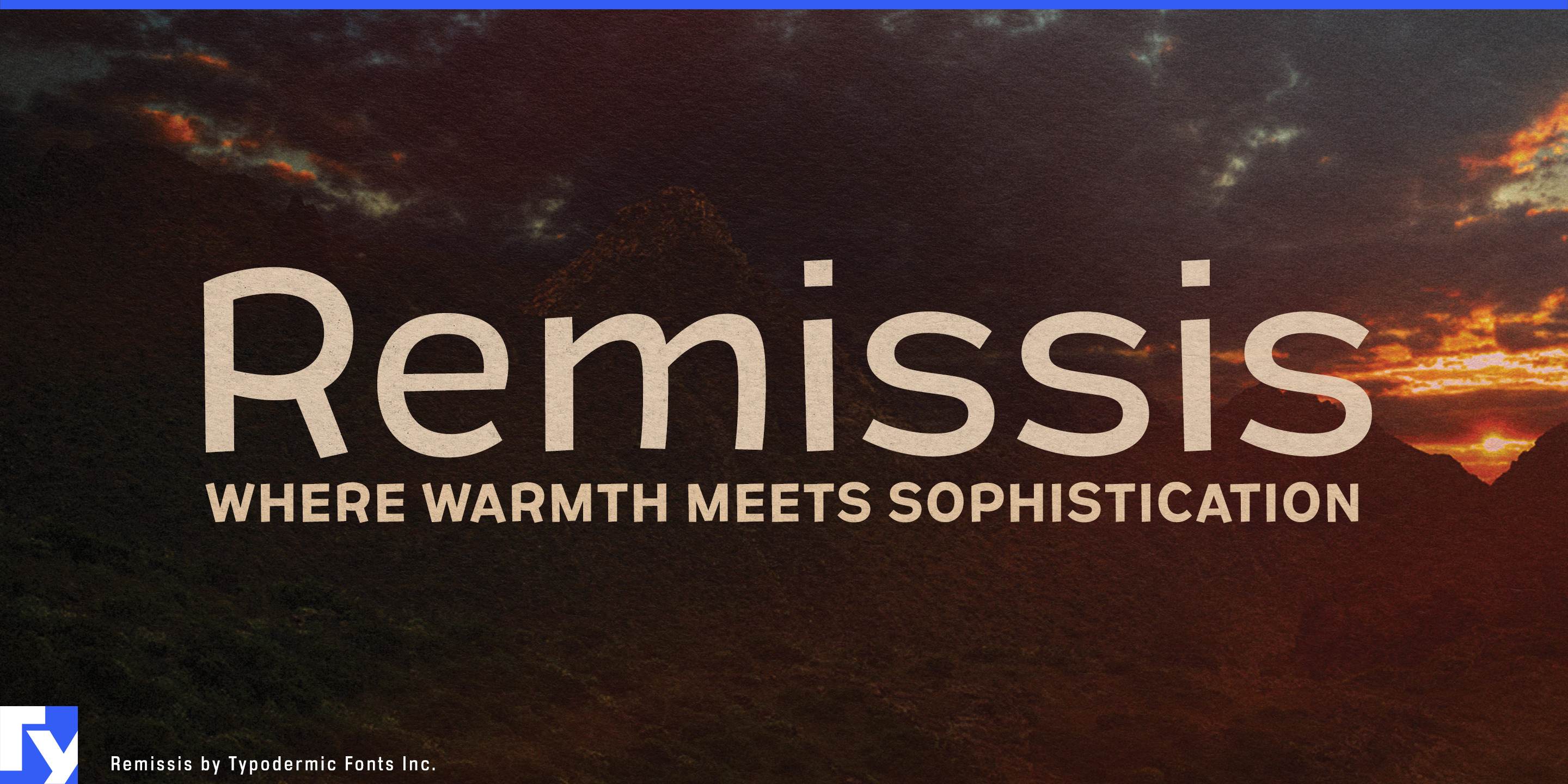
Remissis
Raymond Larabie / Typodermic Fonts Inc. · Regular · Remissis
预览此字体,查看文件详情,并下载设计师提供的完整字体包。

关于这款字体
许可 / 版权: Free desktop license — see included Typodermic EULA
作者说明:
Official free desktop-license package from Typodermic Fonts Inc.
Included font files: Remissis Sb.
Download and retain the complete original ZIP, including read-this.html and the Typodermic Desktop EULA 2026.pdf. The included EULA governs use. This package covers only the listed styles; other styles in the commercial family are not included.
Remissis is for products that are engineered precisely without being engineered to look perfectly uniform.
Its structure is orderly, but selected horizontal strokes sit slightly off the expected grid. Letters such as E, F, L, T and Z introduce small deviations that soften the geometry without making the design look handmade. The result is a rational sans-serif with just enough irregularity to avoid machine-perfect sterility.
That makes Remissis especially useful for architectural materials whose character comes from controlled variation. Recycled-felt acoustic panels, ceiling baffles, wood-wool systems and decorative sound-absorbing screens are manufactured to technical standards while remaining visibly fibrous, mottled or textured. Remissis can give collection names, color families, sample binders, catalogue headings and showroom graphics the same balance between system and variation.
Recycled and composite surfaces present a similar design problem. Terrazzo with visible aggregate, recycled-glass slabs, paper composites, reclaimed-plastic sheets and solid-surface materials with reused inclusions are industrial products whose irregularity is part of their appeal. A rigid geometric sans can make them feel more synthetic than they are; overtly handmade lettering can undermine their technical credibility. Remissis occupies the useful space between those extremes.
Engineered timber, cork products, linoleum, recycled-content flooring and modular interior systems offer related applications. These materials are sold as coordinated, repeatable systems while retaining visible grain, fibers, flecks or other variation. Remissis can handle series names, finish names, swatch cards, architect-facing catalogues, specification-folder covers, showroom headings and trade-show graphics while a more neutral companion takes care of dense technical information.
The same logic extends to emerging bio-based materials such as mycelium boards, agricultural-fiber panels and cellulose composites. These products need to communicate research, manufacturing and measurable performance without looking detached from the substance they are made from.
Remissis does not imitate grain, fibers or aggregate. Its irregularity is quieter than that; the geometry is simply allowed to remain a little less than perfect.
Official information and additional styles:
https://typodermicfonts.com/remissis/
插图与分享
读者评论
分享你对这款字体的意见或使用心得。
还没有评论,来做第一个吧。