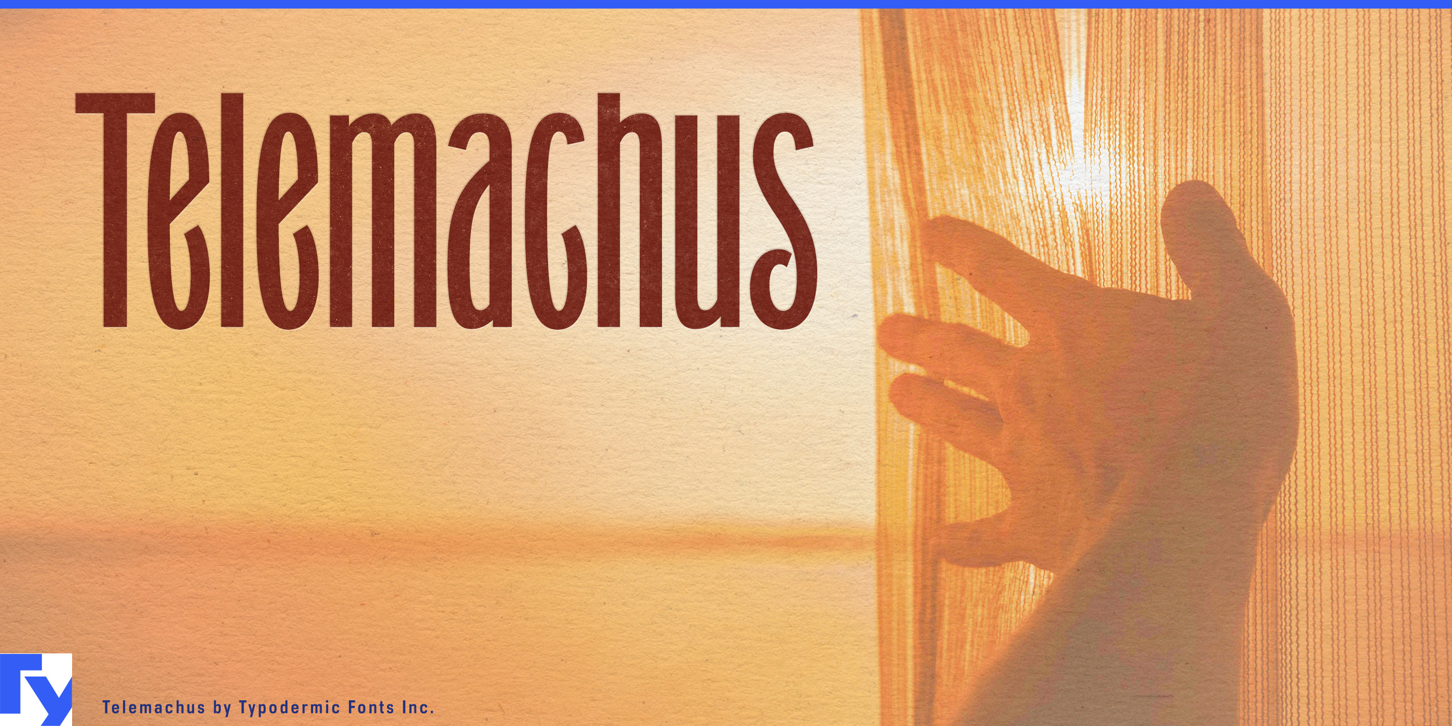
Telemachus
Raymond Larabie / Typodermic Fonts Inc. · Regular · Telemachus
预览此字体,查看文件详情,并下载设计师提供的完整字体包。

关于这款字体
许可 / 版权: Free desktop license — see included Typodermic EULA
作者说明:
Official free desktop-license package from Typodermic Fonts Inc.
Included font files: Telemachus-SemiBold, Telemachus-SemiBold-Italic.
Download and retain the complete original ZIP, including read-this.html and the Typodermic Desktop EULA 2026.pdf. The included EULA governs use. This package covers only the listed styles; other styles in the commercial family are not included.
A long product name on a narrow package creates an awkward choice. Set it large and it wraps around the sides; compress it with a conventional condensed sans and the result can look industrial, athletic, or generically modern. Telemachus offers another option: an extremely narrow display face with enough old commercial character to become part of the identity rather than merely solve a fitting problem.
That makes Telemachus particularly useful for beauty and personal-care packaging, where tall containers provide abundant vertical space but only a narrow front-facing area. Deodorant and sunscreen sticks, body sprays, dry shampoo, styling aerosols, serum and moisturizer pumps, shampoo and conditioner bottles, hand lotion, liquid soap, and salon dispensers can carry surprisingly long names at substantial sizes. The lighter weights bring a wiry elegance to skincare and fragrance-adjacent products; heavier styles give haircare, sun care, and body products more visual weight.
Slim beverage cans pose much the same problem. Botanical sodas, functional sparkling drinks, canned tea, cold brew, electrolyte drinks, premium mixers, and non-alcoholic aperitifs all benefit from lettering that can occupy the available height without sprawling around the cylinder. Telemachus brings more historical warmth than the usual condensed sports or tech typography, making it particularly useful for botanical and tonic-style products.
The same proportions work across hotel and spa amenity systems: wall-mounted shampoo and body-wash bottles, hand-soap and lotion pumps, treatment products, bath supplies, and room sprays. Refillable home-care products such as hand soap, dish soap, linen spray, and fabric treatments can use the same vertical labeling logic.
Telemachus also earns its keep wherever horizontal space genuinely disappears: narrow storefront piers, column-mounted tenant names, vertical retail panels, food-hall stalls, exhibition graphics, and constrained architectural signage. Its old commercial flavor can sit comfortably in renovated market halls, historic hotels, and adaptive-reuse spaces without becoming a literal period reproduction.
The design traces back to Grant No. 2, the typeface seen on the cover of Carole King’s Tapestry. That ancestry gives Telemachus an unusual relationship with time. Depending on the context, it can read as antique, mid-century, or strangely futuristic. New transit, clean-energy infrastructure, civic technology, alternative-history entertainment, and retrofuturist exhibitions can use that ambiguity to present progress without defaulting to sleek geometric “future” typography.
Telemachus solves a contemporary spatial problem with a voice that refuses to disappear into utility: long words, narrow surfaces, and a distinctive old-commercial character that can move from a sunscreen stick or salon spray can to a slim botanical drink, hotel dispenser, or vertical shopfront.
Official information and additional styles:
https://typodermicfonts.com/telemachus/
插图与分享
读者评论
分享你对这款字体的意见或使用心得。
还没有评论,来做第一个吧。