Wheaton
Raymond Larabie / Typodermic Fonts Inc. · Regular · Wheaton
预览此字体,查看文件详情,并下载设计师提供的完整字体包。

关于这款字体
许可 / 版权: Free desktop license — see included Typodermic EULA
作者说明:
Official free desktop-license package from Typodermic Fonts Inc.
Included font files: wheaton capitals.
Download and retain the complete original ZIP, including read-this.html and the Typodermic Desktop EULA 2026.pdf. The included EULA governs use. This package covers only the listed styles; other styles in the commercial family are not included.
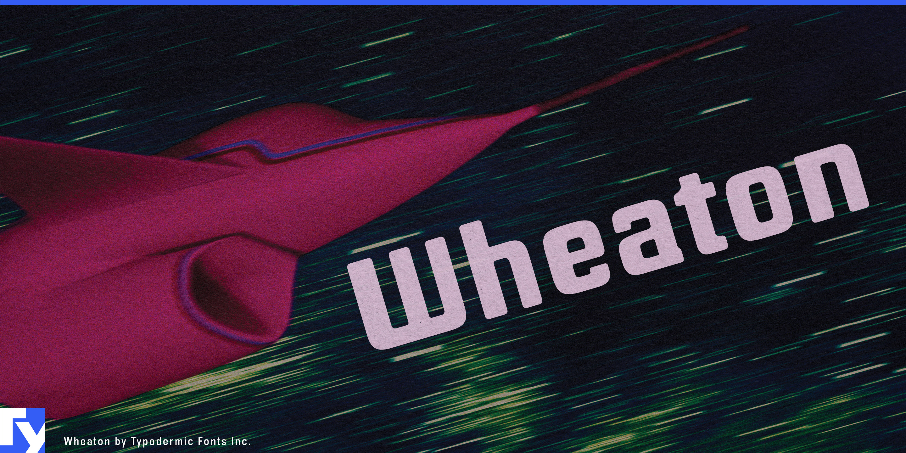
Wheaton takes the magnetic-ink look beyond the bottom of the cheque. It draws on the broader MICR-inspired tradition associated with display faces such as Westminster and Data 70, but does not reproduce a machine-readable standard. Instead, it preserves the squared construction, peculiar interruptions and processed appearance while reducing the extreme contrasts that can make classic MICR lettering difficult to read. The result is a bold display sans with a controlled dose of machine-made strangeness.
Many MICR-inspired alphabets are effective for a short logo or a few isolated capitals, then become exhausting once the novelty begins interfering with the words. Wheaton’s sturdy strokes, compact rhythm and less disruptive shapes hold together across mastheads, title sequences, pull quotes, decks and several lines of large copy. Its lowercase makes mixed-case settings practical, carrying the magnetic-ink flavour beyond a single coded-looking word.
Financial applications are a natural starting point, though they need not resemble traditional banking. Wheaton can frame payment-platform campaigns, fraud-investigation podcasts, financial-crime documentaries, corporate-thriller covers and exhibition graphics about money or automated transactions. The reference is recognizable without becoming a costume; it suggests that the text has passed through some obscure processing system.
That quality also suits subjects involving verification and controlled access. Cybersecurity event titles, identity-management graphics, access-card systems and surveillance-fiction covers can use Wheaton to imply authentication, clearance and institutional technology. For fictional agencies, laboratories and bureaucratic systems, it suggests a visual standard shaped by technical requirements without resorting to the usual stencil, pixel or monospaced computer-font vocabulary.
Wheaton also belongs comfortably in retro electronic culture. Its squared forms and softened corners can evoke early digital equipment, analogue-computing diagrams and vintage broadcast graphics without copying a particular machine or period. Electronic-music sleeves, technology-history exhibits, arcade titles and retro science-fiction paperbacks gain the flavour of MICR lettering without its usual legibility penalty.
Official information and additional styles:
https://typodermicfonts.com/magnetic-ink-wheaton-recognition/
插图与分享
读者评论
分享你对这款字体的意见或使用心得。
还没有评论,来做第一个吧。