Octin Prison
Raymond Larabie / Typodermic Fonts Inc. · Regular · Octin Prison
Veja a prévia desta fonte, confira os detalhes do arquivo e baixe o pacote completo do designer.

Sobre esta fonte
Licença / Copyright: Free desktop license — see included Typodermic EULA
Nota do autor:
Official free desktop-license package from Typodermic Fonts Inc.
Included font files: Octin Prison Rg.
Download and retain the complete original ZIP, including read-this.html and the Typodermic Desktop EULA 2026.pdf. The included EULA governs use. This package covers only the listed styles; other styles in the commercial family are not included.
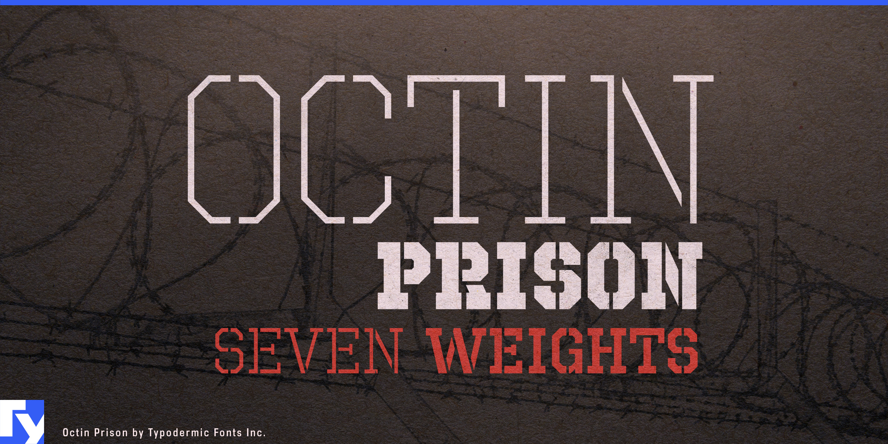
A military stencil marks equipment. Octin Prison marks boundaries.
Its all-caps octagonal slab-serif construction combines stencil breaks with a heavier, more restrictive structure, creating typography that suggests containment, classification and institutional control. Seven weights from Extra-Light through Black give the idea far more range than a single heavy novelty prison face; lighter styles can handle secondary labels and environmental headings, while the heavier weights make titles and identifiers more imposing.
Prison dramas and incarceration-themed entertainment are the most literal applications. Series titles, episode headings, cell-block identifiers, inmate numbers, promotional graphics and fictional institutional signage can share the same visual language. In prison-management and escape games, the family can extend beyond the title into zone names, mission headings, menu categories and controlled-area labels.
Dystopian settings broaden that idea beyond literal prisons. Fictional detention centers, quarantine sectors, maximum-security laboratories, labor compounds and authoritarian institutions need typography for clearance levels, holding areas, personnel classifications, sector names and warning headings. Octin Prison suggests an organization built around rules and restricted movement without automatically turning the setting into a military base.
Prison-history documentaries, criminal-justice series and archival investigations can use the family more selectively for title cards, chapter headings and promotional graphics with an overt institutional tone. Prison-break attractions, dystopian escape experiences, immersive theatre and themed horror environments can carry the same language into facility names, checkpoint graphics, cell blocks, room identifiers and tickets.
Octin Prison also has a narrower role in strength culture where prison-yard imagery is deliberately part of the identity. Hardcore gyms, weighted-calisthenics programs, strength challenges and training apparel can use the slab-stencil construction without drifting into ordinary varsity lettering.
Octin Prison belongs to a coordinated six-family series. Octin College handles non-athletic academic identity; Octin Sports provides the varsity slab-serif voice; Octin Stencil handles tactical and logistical marking; Octin Vintage adds worn heritage texture; and Octin Spraypaint supplies a fresher painted treatment. Octin Prison is the branch for controlled environments, confinement narratives and institutional systems where the typography should make the restrictions visible.
Official information and additional styles:
https://typodermicfonts.com/octin-prison/
Ilustração e compartilhar







Comentários dos leitores
Compartilhe sua opinião ou notas de uso sobre esta fonte.
Ainda não há comentários. Seja o primeiro.