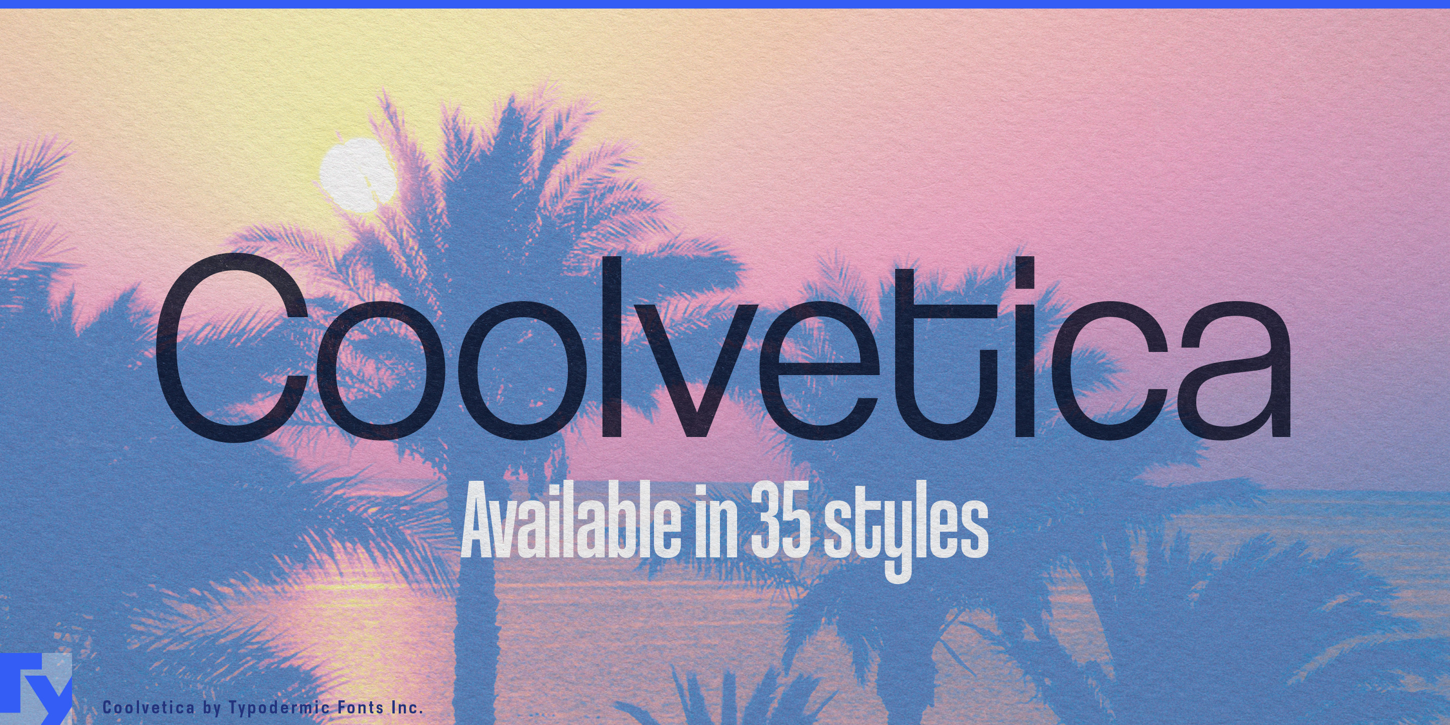
Coolvetica
Raymond Larabie / Typodermic Fonts Inc. · Regular · Coolvetica
Pratinjau font ini, periksa detail file, lalu unduh paket lengkap dari desainer.

Tentang font ini
Lisensi / Hak cipta: Free desktop license — see included Typodermic EULA
Catatan pembuat:
Official free desktop-license package from Typodermic Fonts Inc.
Included font files: Coolvetica Hv Comp, Coolvetica Rg Cond, Coolvetica Rg Cram, Coolvetica Rg, Coolvetica Rg It.
Download and retain the complete original ZIP, including read-this.html and the Typodermic Desktop EULA 2026.pdf. The included EULA governs use. This package covers only the listed styles; other styles in the commercial family are not included.
Coolvetica is display typography through and through. Its tight spacing gives headlines, product names, and short campaign phrases an almost custom-lettered snap; that same density makes it a poor choice for deep reading in sustained text. The broader family does not turn Coolvetica into a general-purpose sans serif. It gives designers more ways to keep display type large when the available space changes.
That matters most in product systems built around incompatible package shapes. A hair-care or personal-care range may have to place one visual identity across broad cartons, narrow styling tubes, pump bottles, refill pouches, treatment jars, salon displays, and transit advertising. Short names can spread comfortably across wide panels, while longer product names can move into narrower styles instead of shrinking into secondary information.
National beverage systems create the same problem at larger scale. A sparkling-water or functional-drink line may span slim cans, bottles, multipacks, vending machines, refrigerator headers, convenience-store displays, and delivery-app graphics. Flavour names can vary dramatically in length; Coolvetica’s width range lets them remain prominent graphic elements rather than forcing every package to accommodate the longest one.
Seasonal fashion and beauty campaigns introduce another set of rectangles. One collection name or promotional phrase might have to fill a storefront window, narrow entrance lightbox, escalator graphic, shopping bag, transit poster, mobile ad, and digital sign. Coolvetica’s condensed and compressed styles let campaign language stay deliberately oversized where a standard-width face would wrap awkwardly or become too small.
Localized entertainment campaigns face a similar challenge. A streaming comedy, reality series, food competition, or music documentary may need title graphics for television interfaces, square thumbnails, vertical mobile ads, billboards, merchandise, and event displays. Translation can change the length of a title or tagline dramatically; Coolvetica’s range makes it possible to adapt the proportions while preserving the dense, logo-like character of the campaign.
When the rectangle changes, the words do not have to surrender. Coolvetica’s range gives designers multiple ways to preserve large, tightly fitted display typography across product lines, campaigns, and localized assets. Use it for the headline, product name, collection title, or phrase that has to dominate the composition; hand the paragraphs to something else.
Official information and additional styles:
https://typodermicfonts.com/coolvetica/
Apakah ini font Anda? Klaim font ini
Ilustrasi dan berbagi












Komentar pembaca
Bagikan masukan atau catatan penggunaan untuk font ini.
Belum ada komentar. Jadilah yang pertama.