Gameness
Raymond Larabie / Typodermic Fonts Inc. · Regular · Gameness
Pratinjau font ini, periksa detail file, lalu unduh paket lengkap dari desainer.
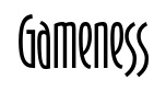
Tentang font ini
Lisensi / Hak cipta: Free desktop license — see included Typodermic EULA
Catatan pembuat:
Official free desktop-license package from Typodermic Fonts Inc.
Included font files: Gameness-Light, Gameness-LightItalic.
Download and retain the complete original ZIP, including read-this.html and the Typodermic Desktop EULA 2026.pdf. The included EULA governs use. This package covers only the listed styles; other styles in the commercial family are not included.
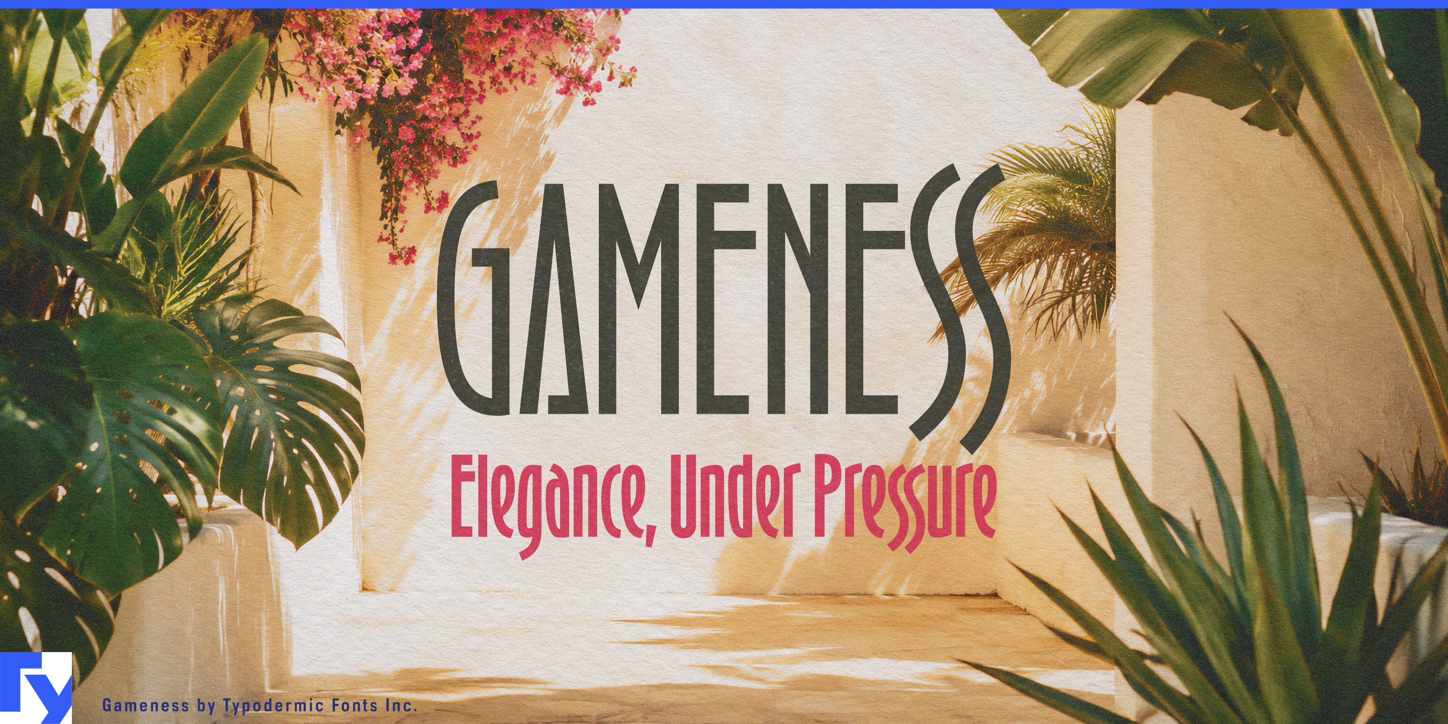
A glamorous Art Deco headline is easy to find. The harder problem begins when that headline has to become an identity system. A resort, restaurant or luxury venue may need whisper-thin lettering for a spa treatment or wine list, a stronger voice for menus and signs, and something dramatically heavier for an event poster or nightclub entrance. Gameness stretches the same narrow Deco construction across nine weights from Thin to Black, with matching italics, giving designers far more room to change the volume without changing the visual language.
Luxury resorts are especially natural territory. A single property may contain a spa, pool club, cocktail bar, restaurants, boutiques and evening events, each requiring a different typographic emphasis. Gameness can move from fine suite names and treatment headings to substantial venue identities, seasonal programs and large promotional titles while keeping the property visually connected.
Restaurants make particularly good use of that range. Fine-dining rooms, hotel restaurants, modern brasseries and destination dining venues need typography for restaurant names, tasting menus, wine lists, private-dining cards and special-event graphics. Lighter weights bring elegance to short menu headings; heavier styles give a restaurant name enough presence for windows, exterior signs and promotional material. The narrow proportions also work well in menu columns and tall formats where horizontal space is limited.
Cocktail bars, supper clubs, hotel lounges and cabaret venues can push farther into the heavier end of the family. Heavy and Black can turn a short event title into a compressed architectural shape, while Thin or Extra-Light can return on the drinks list or reservation card. Gameness can suggest Art Deco nightlife without forcing every project into a costume version of the 1920s.
Luxury travel, fragrance, jewelry and fashion open further territory. Boutique cruises, yacht charters and luxury rail journeys can use Gameness across itinerary covers, cabin names, restaurant graphics and evening programs. Perfume names, beauty collections, jewelry campaigns and runway graphics can move from restrained light weights to much heavier promotional typography while remaining recognizably part of the same system.
Gameness has the vertical elegance associated with Art Deco display lettering, but its unusually broad weight range makes it more than a one-line period accent. Eighteen styles, including matching italics and a full lowercase, let one visual language move from a quiet spa menu to a restaurant façade, a perfume label to a rooftop event poster, or a resort room card to the name above the bar.
Official information and additional styles:
https://typodermicfonts.com/gameness/
Ilustrasi dan berbagi
Komentar pembaca
Bagikan masukan atau catatan penggunaan untuk font ini.
Belum ada komentar. Jadilah yang pertama.