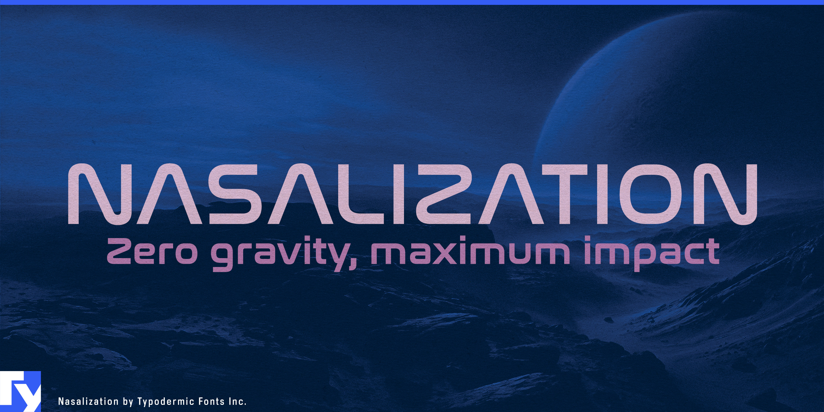
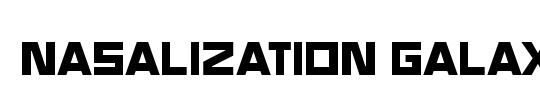
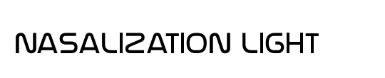
Nasalization
Raymond Larabie / Typodermic Fonts Inc. · Regular · Nasalization
Prévisualisez cette police, consultez les détails du fichier et téléchargez le paquet complet du créateur.

À propos de cette police
Licence / Copyright : Free desktop license — see included Typodermic EULA
Note de l’auteur :
Official free desktop-license package from Typodermic Fonts Inc.
Included font files: Nasalization Rg.
Download and retain the complete original ZIP, including read-this.html and the Typodermic Desktop EULA 2026.pdf. The included EULA governs use. This package covers only the listed styles; other styles in the commercial family are not included.
Putting a name on a high-performance object is harder than it looks. A bicycle frame, ski, helmet, racquet, paddle or spacecraft may be shaped around speed, precision and engineered materials, but its model name still has to look as though it belongs there. An ordinary geometric sans can feel like an afterthought; excessively futuristic lettering can turn serious equipment into a movie prop. Nasalization occupies the useful territory between those extremes.
Its broad, low-contrast geometry gives product names and model designations a distinctly engineered appearance while keeping the letterforms recognizable. The expanded proportions work especially well across long physical surfaces: bicycle down tubes, skis and snowboards, fitness machines, protective equipment and other sporting goods. Heavier weights can turn a short model name into a major part of the product graphics, while lighter weights handle series names, specifications and secondary markings within the same visual system.
That affinity with engineered objects has a genuine source. Nasalization began in 1997 as a modular all-caps design inspired by the geometry of NASA’s 1975 “worm” logo, extending the logic of its four letters into a complete alphabet. The family later grew to include lowercase, six weights with italics, Greek and Cyrillic support, contextual forms for M and W, and alternatives such as a cross-barred A. Its connection with spaceflight eventually came full circle through use associated with NASA’s Perseverance Mars mission.
Aerospace, satellite technology, space robotics and scientific equipment therefore feel as natural to Nasalization as performance sports. It can carry spacecraft names, launch-system identities, equipment markings, exhibition graphics and large technical headings without resorting to fractured or gimmicky sci-fi forms. Planetariums, astronomy exhibitions, science centers and model-rocket products can draw on the same visual language. Across all of these uses, Nasalization is particularly good at one job: making the name of an engineered thing look like part of the engineering.
Official information and additional styles:
https://typodermicfonts.com/nasalization/
Cette police est à vous ? Revendiquez-la
Illustration et partage







Commentaires des lecteurs
Partagez votre avis ou vos notes d’utilisation.
Aucun commentaire pour l’instant. Soyez le premier.