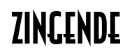
Zingende
Raymond Larabie / Typodermic Fonts Inc. · Regular · Zingende
Prévisualisez cette police, consultez les détails du fichier et téléchargez le paquet complet du créateur.
À propos de cette police
Licence / Copyright : Free desktop license — see included Typodermic EULA
Note de l’auteur :
Official free desktop-license package from Typodermic Fonts Inc.
Included font files: Zingende Bd It, Zingende Bd.
Download and retain the complete original ZIP, including read-this.html and the Typodermic Desktop EULA 2026.pdf. The included EULA governs use. This package covers only the listed styles; other styles in the commercial family are not included.
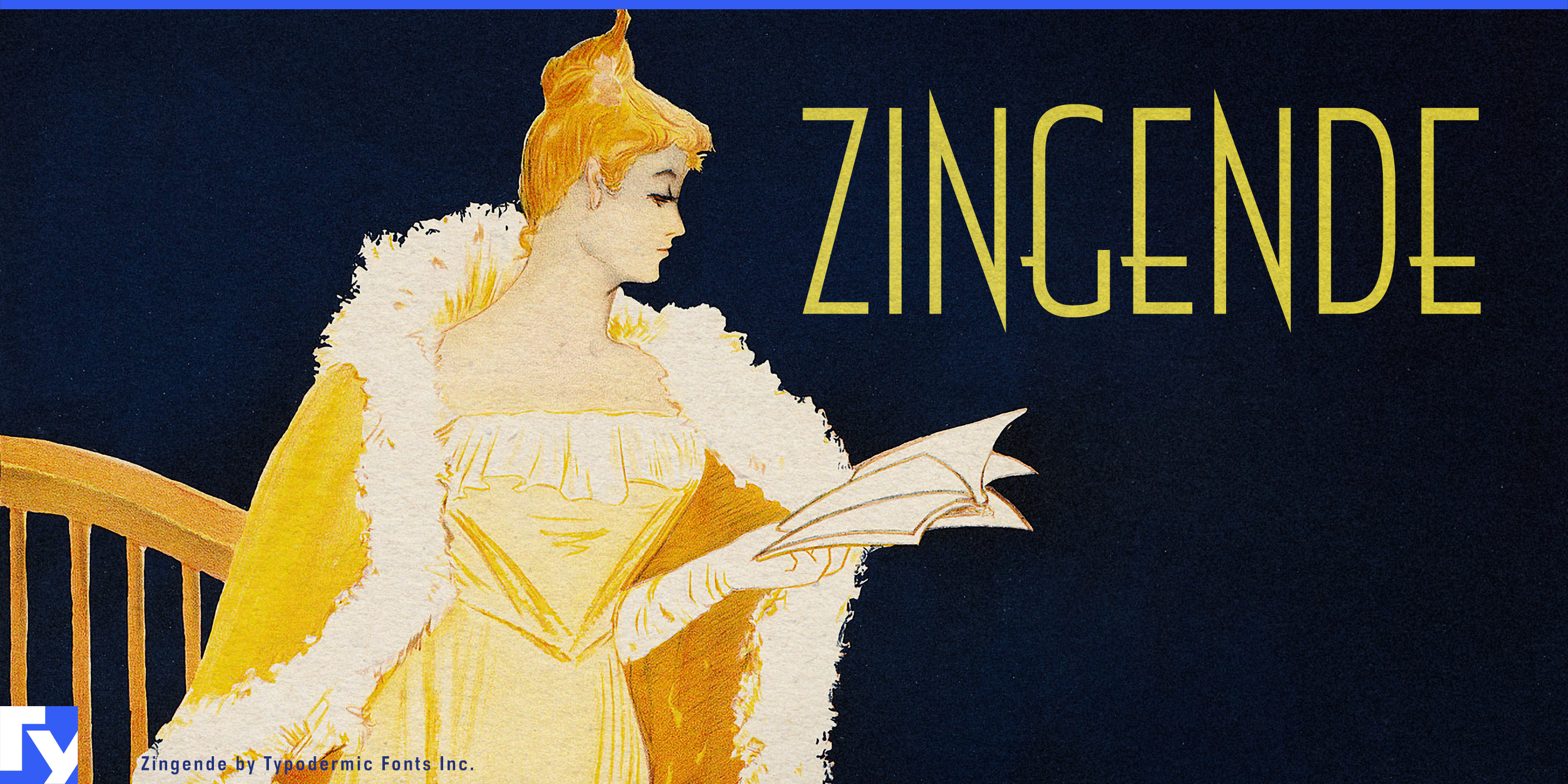
Zingende is Art Deco for projects that cannot afford to look like Art Deco theme night.
Its tall, narrow forms retain the sharp geometry and vertical rhythm associated with 1920s and 1930s display lettering, but the strokes are essentially monolinear rather than dramatically thick and thin. That gives Zingende a period connection without the theatricality that can make conventional Deco typography feel like costume.
Restored Art Deco hotels and adaptive-reuse hospitality are a natural fit. A hotel in a 1930s tower, a cocktail bar inside a former cinema or a contemporary property built around Deco interiors needs typography for far more than a logo. Zingende can handle building names, restaurant and bar names, elevator-lobby headings, room categories, menu sections and event graphics while remaining restrained enough to coexist with original stonework, metalwork and furnishings.
Luxury rail offers a related setting. Sleeper-train identities, carriage names, route titles, dining-car graphics, menus, onboard publications and campaign headlines can reference the visual language of interwar travel without becoming replicas of old railway posters. The oblique styles add movement while preserving the same narrow construction.
Art Deco residential and commercial property creates another strong application. Restored towers, former banks converted to residences and new developments that borrow stepped forms, metalwork and geometric ornament can use Zingende for property names, amenity names, sales-gallery graphics and large-scale architectural signage. Its vertical emphasis works particularly well when the architecture itself is tall, narrow and rhythmically divided.
Museums and cultural institutions can use Zingende for exhibitions concerned with Art Deco, interwar fashion, jewelry, ocean liners, architecture, industrial design and decorative arts. Exhibition titles, gallery sections, dates and catalogue covers can acknowledge the period without competing with objects that may already be highly ornamental.
The Deco style pushes the construction further by filling the counters and turning the letters into bold geometric silhouettes. It works best as an accent for feature-wall titles, campaign key art and dramatic venue names.
Zingende keeps the architecture of Art Deco while stripping away much of the stagecraft.
Official information and additional styles:
https://typodermicfonts.com/zingende/
Illustration et partage
Commentaires des lecteurs
Partagez votre avis ou vos notes d’utilisation.
Aucun commentaire pour l’instant. Soyez le premier.