Rukyltronic
Raymond Larabie / Typodermic Fonts Inc. · Regular · Rukyltronic
I-preview ang font na ito, tingnan ang detalye ng file, at i-download ang buong package ng designer.
Tungkol sa font na ito
Lisensya / Copyright: Free desktop license — see included Typodermic EULA
Tala ng may-akda:
Official free desktop-license package from Typodermic Fonts Inc.
Included font files: rukyltronic star.
Download and retain the complete original ZIP, including read-this.html and the Typodermic Desktop EULA 2026.pdf. The included EULA governs use. This package covers only the listed styles; other styles in the commercial family are not included.
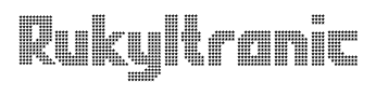
Some pixel fonts begin with ordinary lettering and reduce it to a grid. Rukyltronic works the other way around. Its compact, squared forms were conceived inside the logic of low-resolution displays, with unusual stroke routes and proportions that already feel native to a grid before any surface treatment is applied.
That makes sports a surprisingly natural territory. Team names, jersey lettering, player-introduction graphics and tournament titles can use the same condensed proportions and unconventional stroke logic that give custom athletic lettering its identity. Circle and Star evoke classic electronic scoreboards, while Grid, Network, Mesh and Screen provide different internal structures without changing the underlying silhouette.
Those related treatments let a team or event maintain one lettering system across uniforms, arena displays, ribbon boards, playoff graphics and promotional campaigns. Home, away and alternate versions can change surface treatment while keeping the same basic wordmark.
Large LED environments extend the idea beyond sports. Arena video walls, transparent storefront displays, media façades and trade-show screens are themselves built from visible grids of light. Set large enough for the internal cells to register, Rukyltronic can make a team name, event title or installation graphic feel native to the display rather than merely placed on it.
Its British home-computer ancestry still provides a legitimate historical branch. Retrocomputing exhibitions, homebrew software, FPGA recreations and coding events can use Rukyltronic when a generic square-pixel alphabet feels too ordinary.
Rukyltronic works best when the grid itself matters: a team name on a scoreboard, an arena identity moving between uniforms and LED displays, a media installation built from visible pixels or a project revisiting early home-computer graphics. The letterforms stay recognizable while the surface changes around them.
Official information and additional styles:
https://typodermicfonts.com/rukyltronic/
Ilustrasyon at pagbabahagi
Wala pang larawang ilustrasyon para sa entry na ito.
Mga komento ng mambabasa
Magbahagi ng feedback o tala tungkol sa font na ito.
Wala pang komento. Maging una ka.