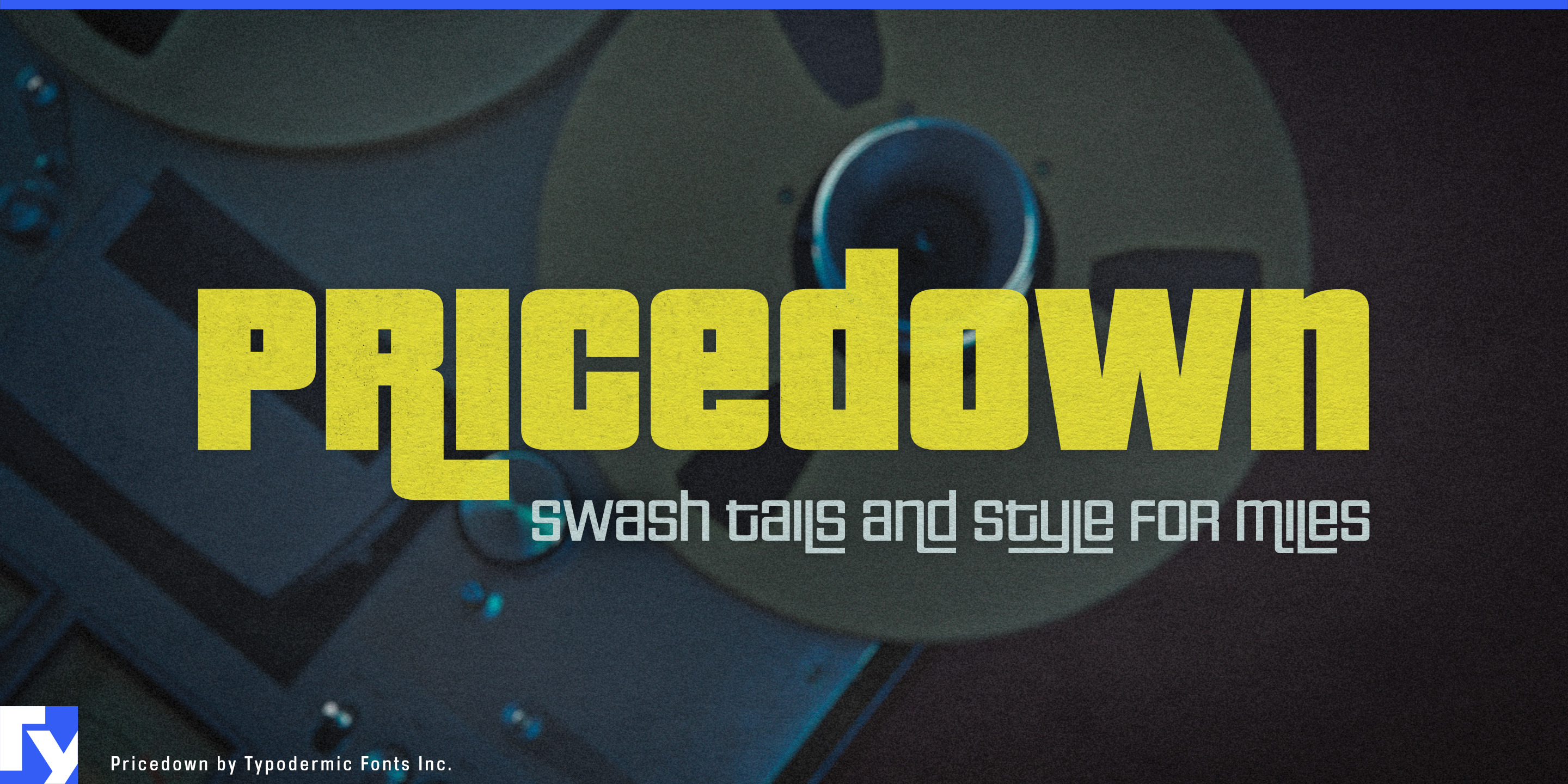
Pricedown
Raymond Larabie / Typodermic Fonts Inc. · Regular · Pricedown
Previsualiza esta fuente, revisa los detalles del archivo y descarga el paquete completo del diseñador.

Sobre esta fuente
Licencia / Copyright: Free desktop license — see included Typodermic EULA
Nota del autor:
Official free desktop-license package from Typodermic Fonts Inc.
Included font files: Pricedown Bl.
Download and retain the complete original ZIP, including read-this.html and the Typodermic Desktop EULA 2026.pdf. The included EULA governs use. This package covers only the listed styles; other styles in the commercial family are not included.
Pricedown is often recognized through its dense, heavy styles, but the lighter weights reveal a very different side of the same construction. As the strokes thin out, rectangular loops, extended lines, interlocking forms, and swashes become more exposed. Hairline, Thin, and Extra-Light can suggest bent light, illuminated tubing, or continuous graphic paths while remaining unmistakably part of the family.
That makes Pricedown particularly useful for nightclub identities. A venue may run weekly residencies, guest-DJ series, named rooms, anniversary events, membership programs, and changing artist lineups across exterior signs, LED walls, projection graphics, social campaigns, wristbands, guest-list screens, and event calendars. Lighter Pricedown styles can establish the recurring visual language, while progressively heavier weights provide stronger levels for major artists, event names, and headline moments.
At large sizes, the long horizontal runs and rectangular turns become graphic material in their own right. They can stretch across an LED wall, frame a lineup, run through an animated title sequence, or become an illuminated entrance mark without carrying the visual mass of the heavier styles.
Electronic-music labels and artist collectives face a similar problem. Release-series names, artist rosters, compilation titles, catalogue graphics, showcase nights, streaming artwork, physical editions, and merchandise need to remain recognizably related without repeating one fixed logo. Pricedown’s weight range and interlocking forms can turn those changing names into parts of a larger system.
Touring club events and electronic-music festivals extend the same language into stage names, artist announcements, timetable headings, accreditation, LED backdrops, and motion packages. The lighter styles are especially useful when many names need to coexist while retaining a distinctive structural connection.
The visual language also transfers naturally to the equipment behind the room. DJ controllers, mixers, headphones, club sound systems, lighting fixtures, lasers, and LED equipment need product names, model identifiers, control-surface graphics, cartons, trade-show displays, and launch campaigns. The linear weights can sit comfortably on physical equipment, while heavier Pricedown styles take over in the promotional graphics surrounding it.
Pricedown’s full range lets an identity move through several levels of intensity without abandoning its rectangular construction and interlocking behavior. For clubs, electronic-music labels, touring events, audio hardware, and light-based environments, the lighter weights can carry the system while the heavier styles are reserved for moments that need maximum density.
Official information and additional styles:
https://typodermicfonts.com/pricedown/
Ilustración y compartir



Comentarios de los lectores
Comparte tu opinión o notas de uso sobre esta fuente.
Aún no hay comentarios. Sé el primero.