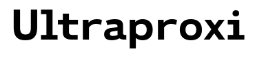
Ultraproxi
Raymond Larabie / Typodermic Fonts Inc. · Regular · Ultraproxi
Previsualiza esta fuente, revisa los detalles del archivo y descarga el paquete completo del diseñador.
Sobre esta fuente
Licencia / Copyright: Free desktop license — see included Typodermic EULA
Nota del autor:
Official free desktop-license package from Typodermic Fonts Inc.
Included font files: ultraproxi sb it, ultraproxi sb.
Download and retain the complete original ZIP, including read-this.html and the Typodermic Desktop EULA 2026.pdf. The included EULA governs use. This package covers only the listed styles; other styles in the commercial family are not included.
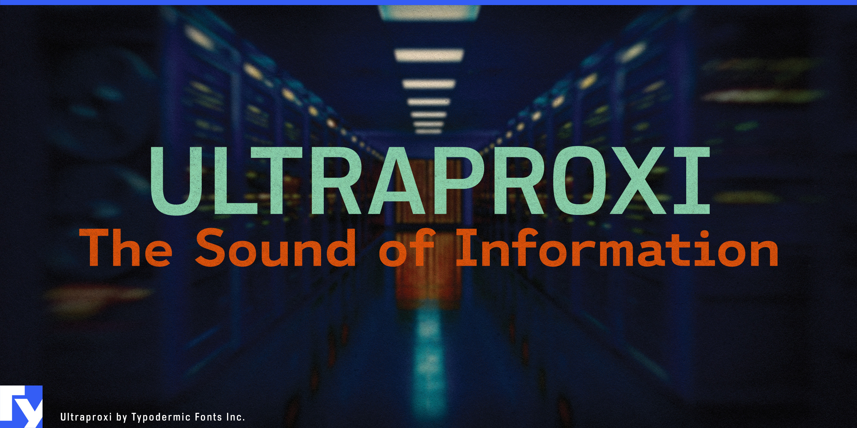
Monospaced typography says “computing” immediately, but equal-width characters are often a poor fit for the words surrounding the code. Product names get loose, headlines develop awkward gaps, and ordinary sentences inherit spacing designed for alignment rather than reading. Ultraproxi keeps the engineered rhythm and machine-made character of monospaced type while using proportional spacing, preserving that technical language without forcing every message onto a character grid.
That distinction is especially useful for developer infrastructure. Database platforms, API companies, cloud services, container tools and developer platforms publish far more than source code: documentation covers, product-family names, launch graphics, conference signage, case studies and technical reports all need ordinary language to look at home beside the software. Ultraproxi can handle those surrounding layers while a true monospaced companion remains available wherever code and character alignment actually matter.
AI infrastructure creates a similar problem. GPU-cloud providers, inference platforms, accelerator hardware companies, data-center networking firms and cooling-system manufacturers need typography that belongs to serious computing without resorting to generic futuristic lettering. Ultraproxi can carry accelerator model names, benchmark-report headings, infrastructure diagrams, conference graphics and product sheets with the visual logic of machine output but the tighter fit of proportional type.
Its computing lineage also makes Ultraproxi useful for mainframe modernization. Banks, insurers, airlines and enterprise technology firms still have to explain migrations from long-lived systems into contemporary cloud and integration platforms. Ultraproxi can connect those eras in modernization reports, architecture diagrams, conference sessions and migration campaigns without turning the subject into retro-computing theatre.
Observability, telemetry and network operations provide another natural setting. These systems are surrounded by machine-generated information, yet much of their communication consists of headings, labels and explanations rather than aligned data. Ultraproxi can occupy that explanatory layer while a true mono handles the logs themselves.
The lighter weights also give Ultraproxi room in technical publishing for semiconductor companies, robotics firms, engineering consultancies and research organizations. Technology reports, conference programs and architecture documents can retain the cadence of machine-generated type while gaining the spacing expected from proportional typography.
Official information and additional styles:
https://typodermicfonts.com/ultraproxi/
Ilustración y compartir
Comentarios de los lectores
Comparte tu opinión o notas de uso sobre esta fuente.
Aún no hay comentarios. Sé el primero.