Uniwars
Raymond Larabie / Typodermic Fonts Inc. · Regular · Uniwars
Previsualiza esta fuente, revisa los detalles del archivo y descarga el paquete completo del diseñador.

Sobre esta fuente
Licencia / Copyright: Free desktop license — see included Typodermic EULA
Nota del autor:
Official free desktop-license package from Typodermic Fonts Inc.
Included font files: Uniwars Hv It, Uniwars Hv.
Download and retain the complete original ZIP, including read-this.html and the Typodermic Desktop EULA 2026.pdf. The included EULA governs use. This package covers only the listed styles; other styles in the commercial family are not included.
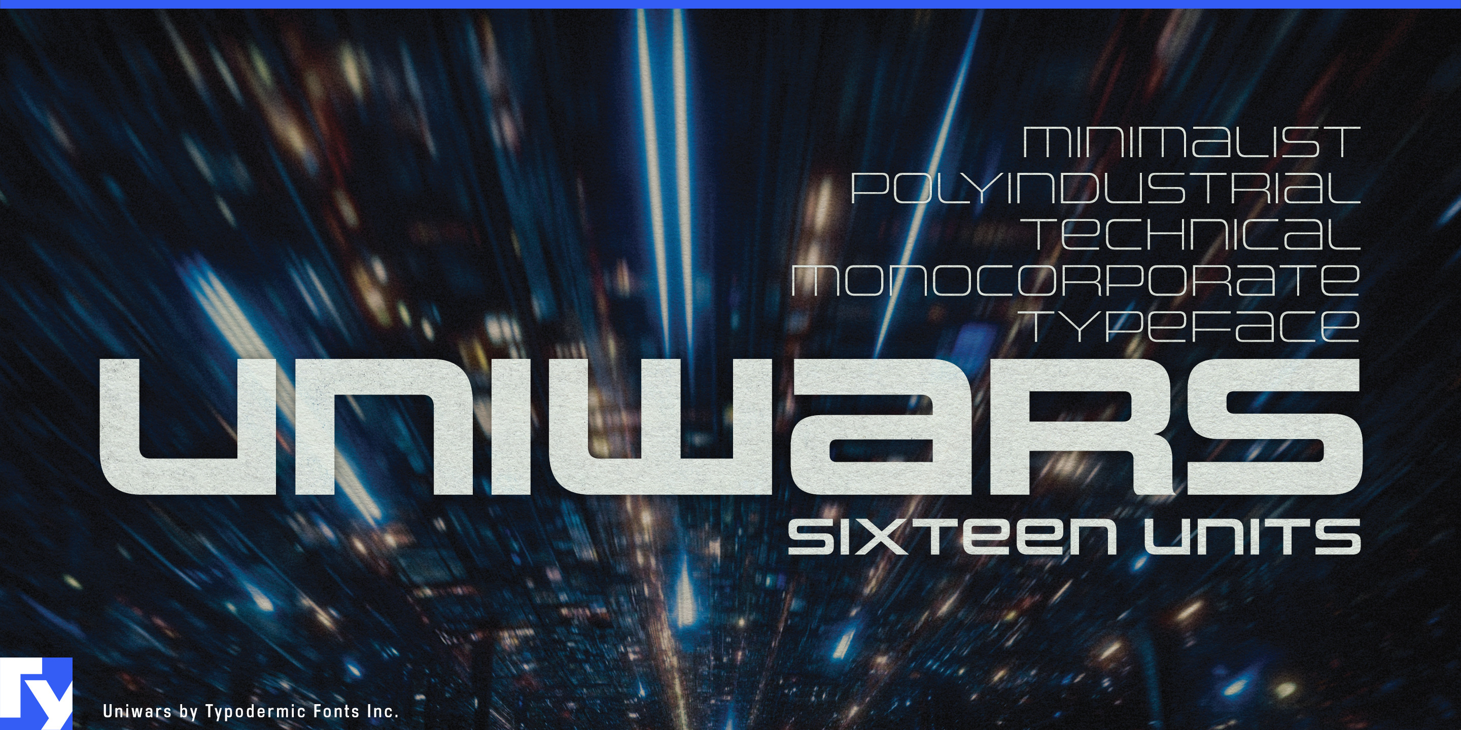
Some of the most expensive products a designer has to brand are also awkwardly shaped for ordinary type. A bicycle down tube, robot arm, drone boom, pipeline or pressure vessel may provide plenty of length but very little height. Set a conventional sans in the middle and the name can look undersized; spread the letters apart and the word begins to lose its shape. Uniwars solves the problem with width built into the letters themselves. Its extended capitals turn short company names, product families and model designations into long, low marks that can travel naturally along engineered surfaces.
That geometry grew from a particular strain of Japanese industrial identity. After moving to Japan, designer Ray Larabie kept encountering broad, constructed techno-industrial logos with the look of lettering worked out on graph paper. Rooted in the 1970s and 1980s, that visual language remained visible on Japanese machinery, corporate marks and vehicle badges. Uniwars develops those proportions into an angular, modular display typeface rather than a generic science-fiction effect; its name reaches back to the 1980 arcade shooter UniWar-S.
Electric bicycles and cargo bikes give Uniwars an especially practical job. Battery-bearing down tubes, frame members and other long structural surfaces can make compact wordmarks disappear. Uniwars lets a short brand or model name occupy the frame without resorting to excessive tracking. The same idea carries into electric motorcycles, performance components and battery systems.
Industrial robotics works at another scale. Collaborative robot arms, warehouse automation, semiconductor equipment and autonomous material-handling systems need manufacturer names and equipment-series identities across housings, rails and articulated structures. Uniwars can handle that branded layer while a conventional sans carries controls, warnings and specifications.
Hydrogen systems, pipelines, pressure vessels, pumps, compressors, cargo drones, eVTOL aircraft and other emerging hardware present the same underlying problem: long surfaces that reward a wide, shallow mark. Across sixteen styles, Uniwars turns that physical constraint into a reason for choosing the typeface.
Official information and additional styles:
https://typodermicfonts.com/uniwars/
Ilustración y compartir
Comentarios de los lectores
Comparte tu opinión o notas de uso sobre esta fuente.
Aún no hay comentarios. Sé el primero.