Venus Rising
Raymond Larabie / Typodermic Fonts Inc. · Regular · Venus Rising
Previsualiza esta fuente, revisa los detalles del archivo y descarga el paquete completo del diseñador.

Sobre esta fuente
Licencia / Copyright: Free desktop license — see included Typodermic EULA
Nota del autor:
Official free desktop-license package from Typodermic Fonts Inc.
Included font files: Venus Rising Rg.
Download and retain the complete original ZIP, including read-this.html and the Typodermic Desktop EULA 2026.pdf. The included EULA governs use. This package covers only the listed styles; other styles in the commercial family are not included.
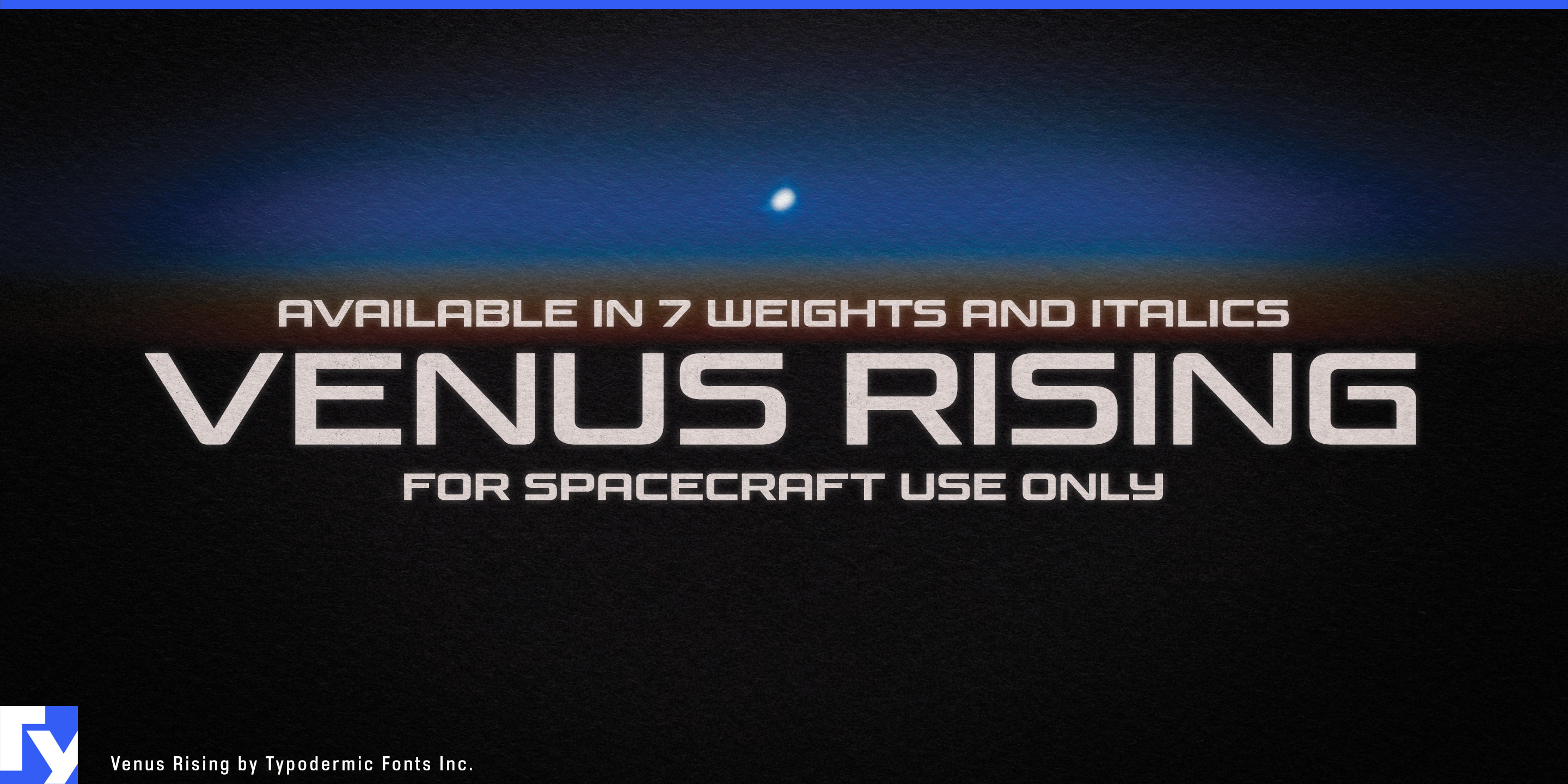
Space typography has plenty of past futures. One direction reaches back to twentieth-century space programs; another leans on cinematic science fiction with cuts, armor and aggressive technological detail. Neither is necessarily right for the spacecraft, satellite systems and lunar hardware being designed for the next decade. Venus Rising offers a different aerospace voice, futuristic through proportion and construction rather than costume.
Its wide, low letterforms seem built to travel across a machine, vehicle or panoramic screen. Squared curves, modular details and interruptions in the strokes establish the technical character without tying the family to one fictional universe. Seven weights from Thin through Heavy, each with an italic, turn that idea into a complete display system. Lighter styles can feel skeletal and scientific; heavier weights give the same structure enough mass for spacecraft names, launch campaigns and major titles.
Commercial aerospace is a natural setting. Satellite manufacturers, launch providers, Earth-observation companies, lunar programs and in-space logistics projects can use Venus Rising for spacecraft series names, satellite fleets, mission titles, rover graphics, vehicle markings and exhibition displays. A quieter companion face can handle telemetry, specifications and dense technical information; Venus Rising names the machine and the program around it.
Its broad proportions are especially effective on spacecraft bodies, launch-vehicle mockups, exhibition walls and widescreen mission graphics. The same structure carries naturally into launch media, including countdown broadcasts, spacecraft reveals, conference displays and mission announcements.
Space simulation and strategy games can use the family on an even larger scale. Fictional manufacturers, ship classes, orbital stations, factions, fleet names and expansion titles can share one visual architecture without relying on a single repetitive sci-fi alphabet. Different weights and italics can distinguish scientific organizations, industrial fleets and major campaign identities while remaining recognizably related.
Planetariums, aerospace museums and science centers offer another strong setting. Dome-show titles, lunar exploration exhibits, satellite galleries and planetary-science displays can signal spaceflight without making serious science look like a movie tie-in.
Venus Rising is most useful when futuristic typography has to become a system rather than a one-shot effect. Its wide proportions suit machines, screens and exhibition environments; its fourteen styles let that identity change weight and stance without changing worlds.
Official information and additional styles:
https://typodermicfonts.com/venus-rising-font/
Ilustración y compartir







Comentarios de los lectores
Comparte tu opinión o notas de uso sobre esta fuente.
Aún no hay comentarios. Sé el primero.