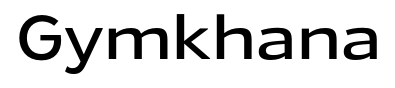
Gymkhana
Raymond Larabie / Typodermic Fonts Inc. · Regular · Gymkhana
اعرض هذا الخط، وراجع تفاصيل الملف، ونزّل الحزمة الكاملة من المصمم.
عن هذا الخط
الترخيص / حقوق النشر: Free desktop license — see included Typodermic EULA
ملاحظة المصمم:
Official free desktop-license package from Typodermic Fonts Inc.
Included font files: Gymkhana Lt.
Download and retain the complete original ZIP, including read-this.html and the Typodermic Desktop EULA 2026.pdf. The included EULA governs use. This package covers only the listed styles; other styles in the commercial family are not included.
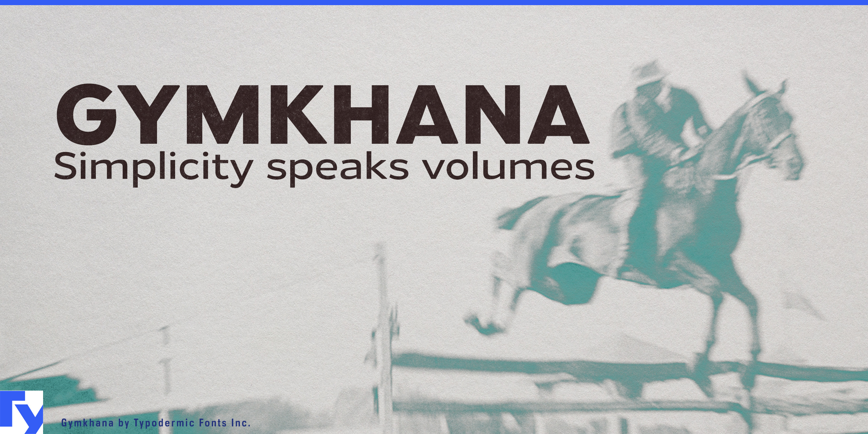
Gymkhana is a sans-serif typeface that thrives on clarity and breathing room. With its generous x-height and relaxed horizontal proportions, it offers an easy, unhurried reading experience—whether you’re scanning a sign across the room or lingering over a printed page. The design draws on the confident geometry of mid-century architectural lettering, yet it softens the edges just enough to feel human and approachable.
From its lightest, most refined weight to its bold, headline-ready heavy, Gymkhana keeps its composure. The italics lean in just enough to add emphasis without breaking the rhythm, making them as usable in body text as in callouts. Its six weights plus italics give you the tools to build clear hierarchies, while support for Latin, Greek, and Cyrillic keeps your message multilingual.
This is a typeface that feels at home in the real world: gallery captions that need to be read from a respectful distance, premium product packaging where understatement is part of the brand, wide-format signage in cultural institutions, or editorial layouts where open space is a design feature. Gymkhana carries itself with quiet authority—never shouting, never rushing—so your words have room to resonate.
Official information and additional styles:
https://typodermicfonts.com/gymkhana/
الصورة والمشاركة
تعليقات القراء
شارك رأيك أو ملاحظاتك حول استخدام هذا الخط.
لا توجد تعليقات بعد. كن أول المعلّقين.