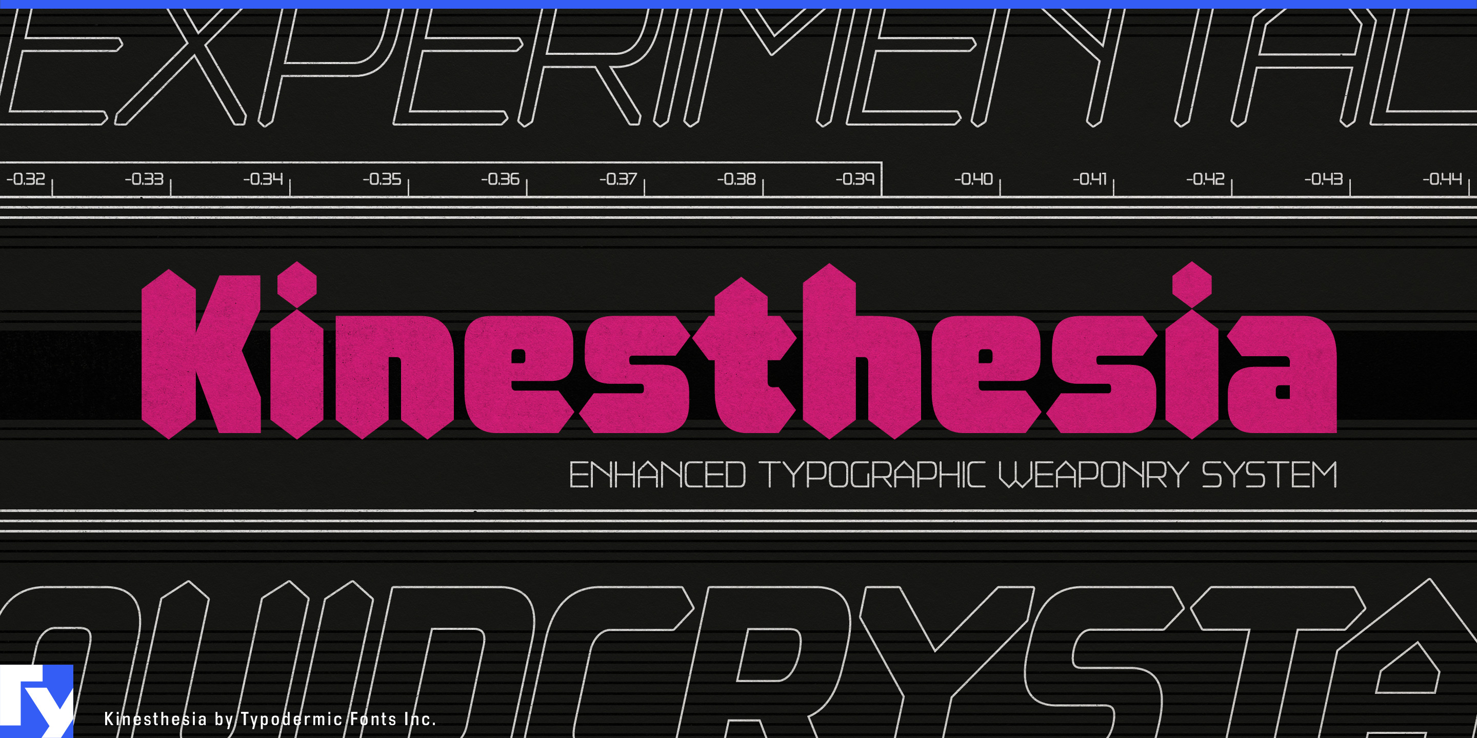
Kinesthesia
Raymond Larabie / Typodermic Fonts Inc. · Regular · Kinesthesia
اعرض هذا الخط، وراجع تفاصيل الملف، ونزّل الحزمة الكاملة من المصمم.

عن هذا الخط
الترخيص / حقوق النشر: Free desktop license — see included Typodermic EULA
ملاحظة المصمم:
Official free desktop-license package from Typodermic Fonts Inc.
Included font files: Kinesthesia-SemiBold, Kinesthesia-SemiBoldItalic.
Download and retain the complete original ZIP, including read-this.html and the Typodermic Desktop EULA 2026.pdf. The included EULA governs use. This package covers only the listed styles; other styles in the commercial family are not included.
Precision equipment has to communicate control and accuracy without disappearing into generic industrial typography. Kinesthesia gives that world a more distinctive display language. Its angular construction and diamond-shaped stroke endings suggest both electronically segmented readouts and surfaces cut by a precision tool; the result feels measured and machined at the same time.
Metrology equipment is a natural fit. Digital calipers, laser measuring systems, torque instruments, machine probes and dimensional-inspection hardware can use Kinesthesia for instrument names, product families, model designations and trade-show graphics, while a quieter companion face handles measurements, instructions and calibration data.
Precision machining extends the same visual logic into CNC tooling, carbide inserts, end mills, tool holders and cutting systems. Series names and catalogue headings can sit comfortably beside beveled metal, machined edges and tightly controlled geometry without relying on the usual aggressively industrial lettering.
Performance measurement provides a more dynamic branch. Cycling power meters, race-timing equipment, lap timers, telemetry systems and sports-testing hardware can use the upright styles for equipment families and the italics for model variants, performance graphics and race-oriented campaigns. Machined wheels, bicycle components and other precision-finished parts offer a related product application.
Seven weights with matching italics give Kinesthesia enough range to build a complete display hierarchy rather than a single dramatic headline. It is a family for things that measure, cut, test and quantify; metrology instruments, machining tools, timing systems and precision components all give its diamond-ended geometry a physical reason to exist.
Official information and additional styles:
https://typodermicfonts.com/kinesthesia
الصورة والمشاركة
تعليقات القراء
شارك رأيك أو ملاحظاتك حول استخدام هذا الخط.
لا توجد تعليقات بعد. كن أول المعلّقين.