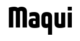
Maqui
Raymond Larabie / Typodermic Fonts Inc. · Regular · Maqui
اعرض هذا الخط، وراجع تفاصيل الملف، ونزّل الحزمة الكاملة من المصمم.
عن هذا الخط
الترخيص / حقوق النشر: Free desktop license — see included Typodermic EULA
ملاحظة المصمم:
Official free desktop-license package from Typodermic Fonts Inc.
Included font files: Maqui Hv It, Maqui Hv.
Download and retain the complete original ZIP, including read-this.html and the Typodermic Desktop EULA 2026.pdf. The included EULA governs use. This package covers only the listed styles; other styles in the commercial family are not included.
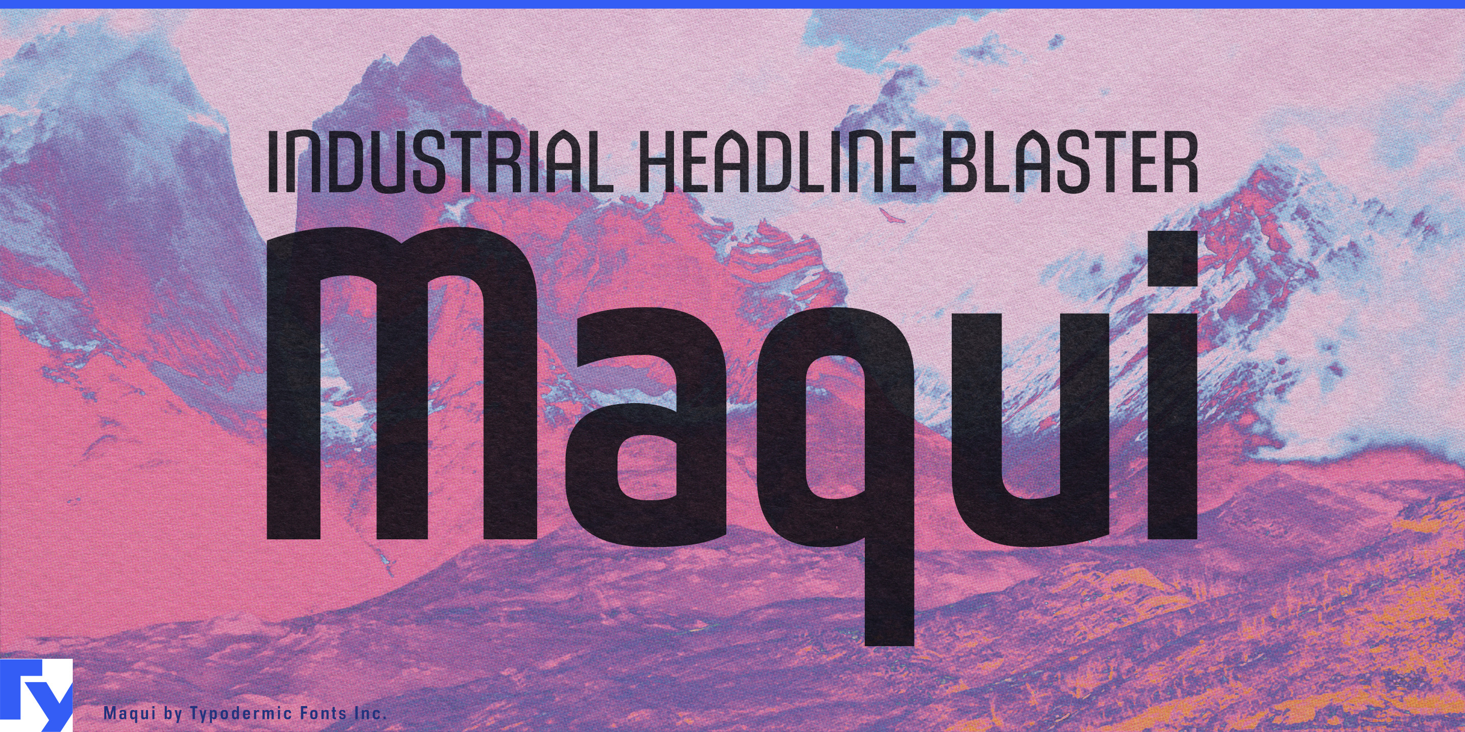
Technology branding often ages faster than the technology itself. Push a typeface too far toward sci-fi and serious equipment starts to look speculative; retreat to a generic corporate sans and every manufacturer begins to resemble everyone else. Maqui offers a quieter alternative: a compact, minimalist display family with enough architectural character to look deliberate without turning typography into the product.
Its narrow proportions are especially useful in the expanding infrastructure behind AI, cloud computing, electrification, and advanced manufacturing. Data-center systems, liquid cooling, rack and enclosure equipment, battery storage, EV charging, switchgear, inverters, grid-control systems, and energy engineering all involve long product names, model numbers, and technical terminology. Maqui can handle equipment-series names, cabinet markings, brochure covers, trade-show walls, project names, and presentation headings without making the technology look like science fiction.
Industrial automation, warehouse robotics, machine vision, semiconductor equipment, CNC systems, and factory-control hardware suit the same restrained approach. Maqui gives machine badges, product-family names, control-panel headings, specification sheets, and exhibition graphics more identity than a default corporate grotesque while remaining quiet beside diagrams, machinery, and dense technical information.
It also fits the systems that shape contemporary buildings: architectural lighting, façade systems, smart glass, commercial HVAC, elevators, access systems, acoustic products, modular construction, and building automation. Large technology campuses, logistics parks, data-center campuses, mixed-use developments, and transit projects can extend the same visual language to hoardings, directories, project signage, and environmental graphics.
Maqui’s defining idea is intentionally modest. Its condensed proportions, squared construction, and distinctive peaked forms introduce just enough authorship into otherwise minimal lettering. It was designed to feel modern and industrial without relying on familiar futuristic tricks, making it particularly useful for products and infrastructure intended to remain in service long after a design trend has passed.
Maqui works best when the typography needs to support the engineering rather than advertise itself: a cooling system beside a technical diagram, a battery platform across an exhibition wall, a machine series stamped onto an enclosure, or a development name stretched across a construction site.
Official information and additional styles:
https://typodermicfonts.com/maqui/
الصورة والمشاركة
تعليقات القراء
شارك رأيك أو ملاحظاتك حول استخدام هذا الخط.
لا توجد تعليقات بعد. كن أول المعلّقين.