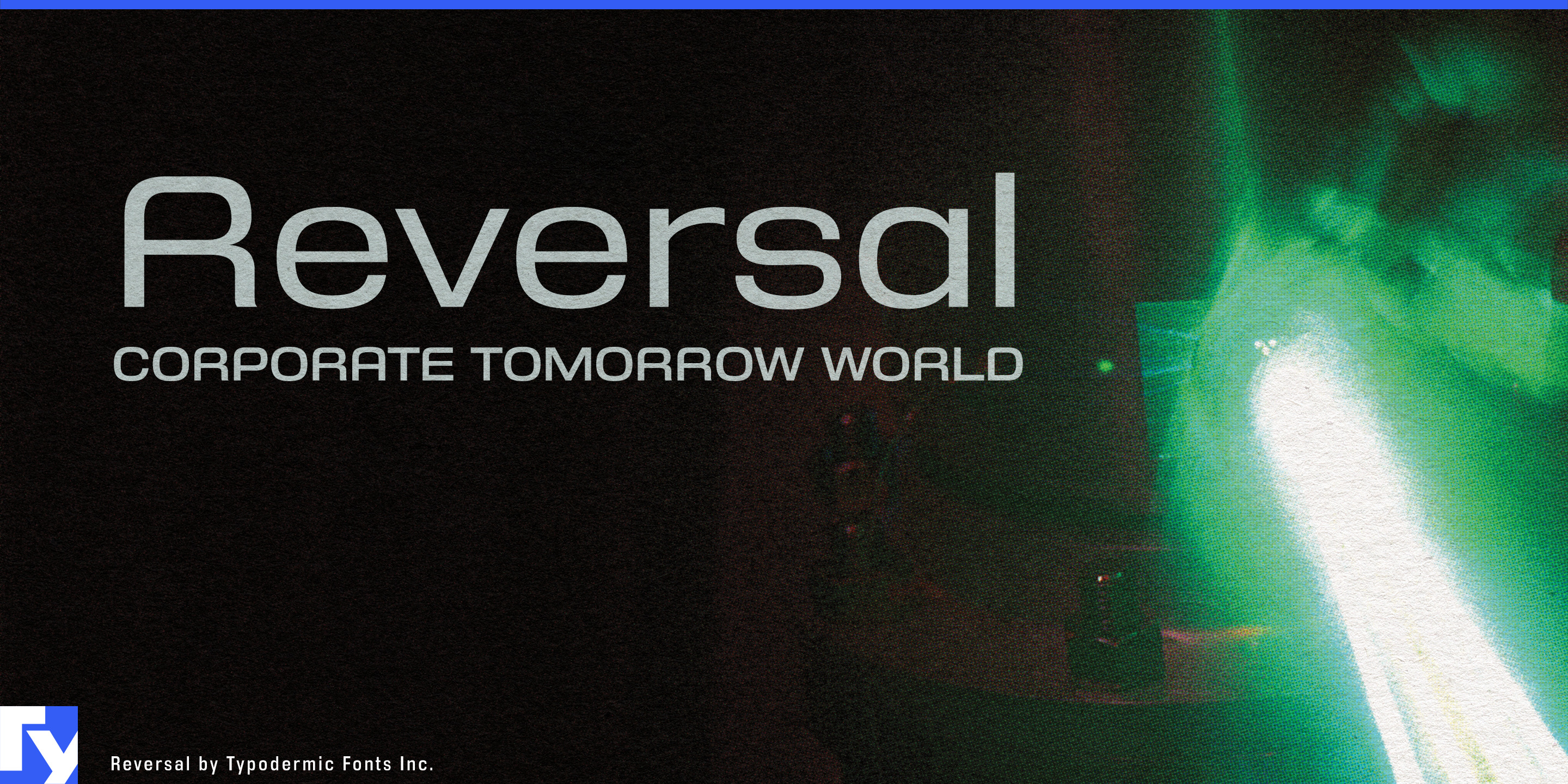
Reversal
Raymond Larabie / Typodermic Fonts Inc. · Regular · Reversal
اعرض هذا الخط، وراجع تفاصيل الملف، ونزّل الحزمة الكاملة من المصمم.

عن هذا الخط
الترخيص / حقوق النشر: Free desktop license — see included Typodermic EULA
ملاحظة المصمم:
Official free desktop-license package from Typodermic Fonts Inc.
Included font files: Reversal Bd It, Reversal Bd.
Download and retain the complete original ZIP, including read-this.html and the Typodermic Desktop EULA 2026.pdf. The included EULA governs use. This package covers only the listed styles; other styles in the commercial family are not included.
Compact products need compact typography, but narrow type often brings a harsher personality than the product itself. Condensed sans serifs can feel urgent or industrial; rounded faces are often too broad for tight physical and digital spaces. Reversal occupies the useful territory between them: space-efficient proportions with the softened geometry of contemporary consumer products.
Its condensed forms avoid the rigid pressure of many narrow grotesks. Squashed circular shapes and smooth construction give Reversal a streamlined, manufactured quality without relying on blades, cuts or overtly futuristic details. Seven weights from Hairline through Extra-Bold, each with an italic, let the family move from light technical headings to substantial product names while preserving the same compact structure.
Urban mobility is a natural setting. Compact EVs, e-bikes, electric scooters and autonomous shuttles all have limited space for model names, service graphics and interface headings, yet their identities extend into apps, charging points and rental systems. Reversal can keep those physical and digital touchpoints related without making approachable mobility products look like heavy machinery.
Service robotics presents a similar problem. Delivery robots, cleaning robots, hospitality machines and autonomous logistics equipment need to look technologically capable without becoming militarized or toy-like. Reversal can handle product-family names, fleet identifiers, launch graphics and short interface headings while a quieter companion face carries dense instructions and operational data.
Wearable monitors, home diagnostic devices, rehabilitation products and other personal health technology can use the same balance. Reversal moves comfortably between device names, packaging, companion apps and campaign graphics where space is limited but the visual language still needs to feel considered and approachable.
Reversal is useful because it saves horizontal space without making the design feel severe. For compact mobility, service robotics and personal devices that need to look engineered without looking aggressive, that balance gives the family its role.
Official information and additional styles:
https://typodermicfonts.com/reversal/
الصورة والمشاركة
تعليقات القراء
شارك رأيك أو ملاحظاتك حول استخدام هذا الخط.
لا توجد تعليقات بعد. كن أول المعلّقين.